Case studyMotion
Bringing the aera Beauty Brand to Life Through Motion
Project overview
aera is a fictional beauty brand built on one idea: beauty is more than the way you look, it is the way you feel. In this self-initiated concept, I designed how the brand moves, with slow, soft motion that lets confidence build instead of shouting for attention.
15seconds
One seamless loop for the whole brand board
4panels
Wordmark, type, colour, and social, moving as one system
4colours
A calm palette from deep navy purple to sky teal
The idea
Section 1 of 5
Motion that feels like confidence
aera speaks to how people feel, not just how they look. Fast, flashy motion would have worked against that. The brand needed movement that feels calm and self-assured, like confidence that grows quietly instead of demanding attention.
- Problem
- Beauty motion is often loud and fast, which clashes with a brand about feeling good.
- Need
- Movement that carries warmth and confidence without rushing.
- Goal
- A motion language that feels as calm as the brand sounds.
Wordmark, type, and colour
Section 2 of 5
Letters that breathe
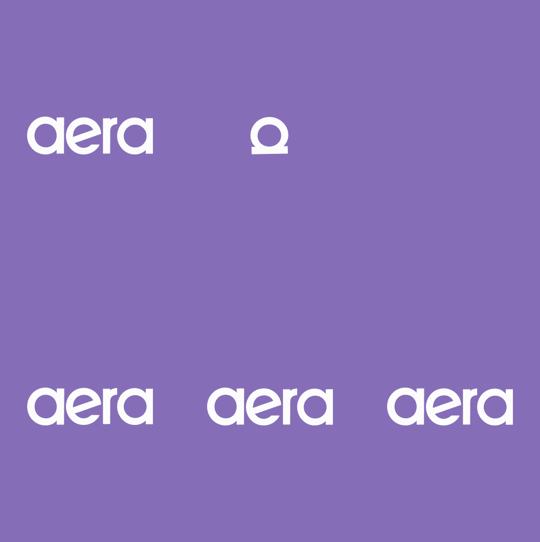
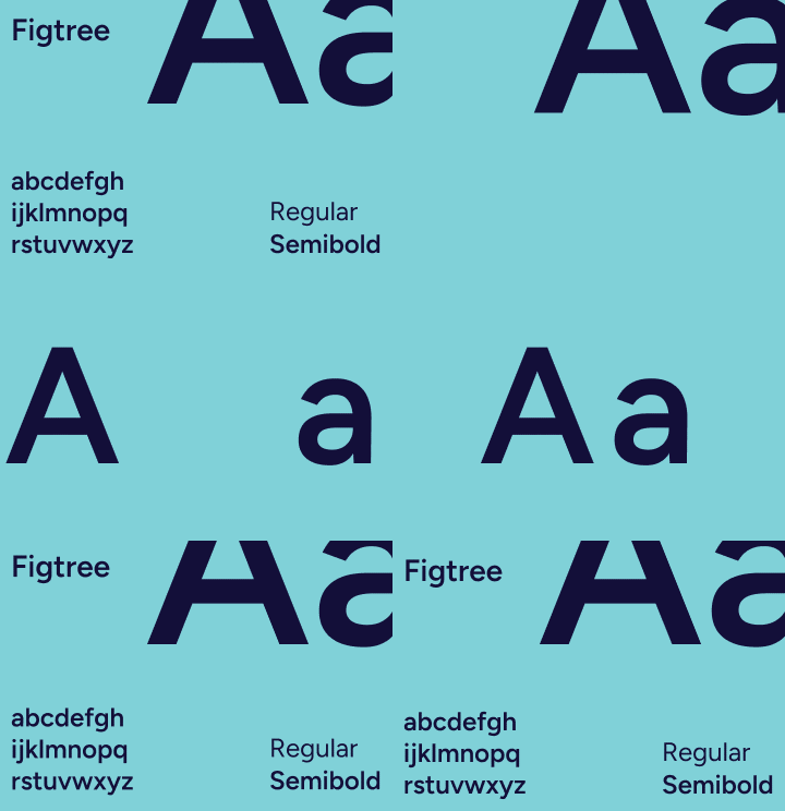
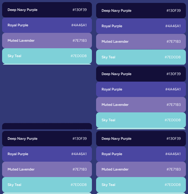
The wordmark folds into its letter a, which grows until its round bowl fills the frame, then the letters return and spread back into aera. The same idea runs through the type and colour: the Figtree specimen splits apart and regroups, and the colour swatches fold away and return in sequence.
- Wordmark
- Folds into its a, grows, and spreads back into the full name.
- Type
- Figtree Regular and Semibold, shown as an "Aa" that splits and regroups.
- Colour
- Deep navy purple, royal purple, muted lavender, and sky teal, cycling in and out.
Social motion
Section 3 of 5
A feed that never rushes
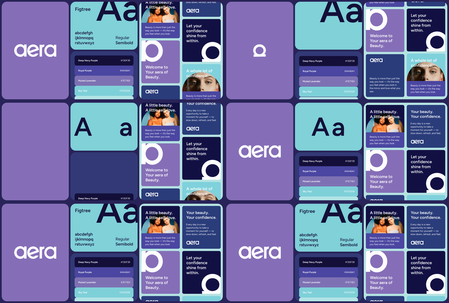
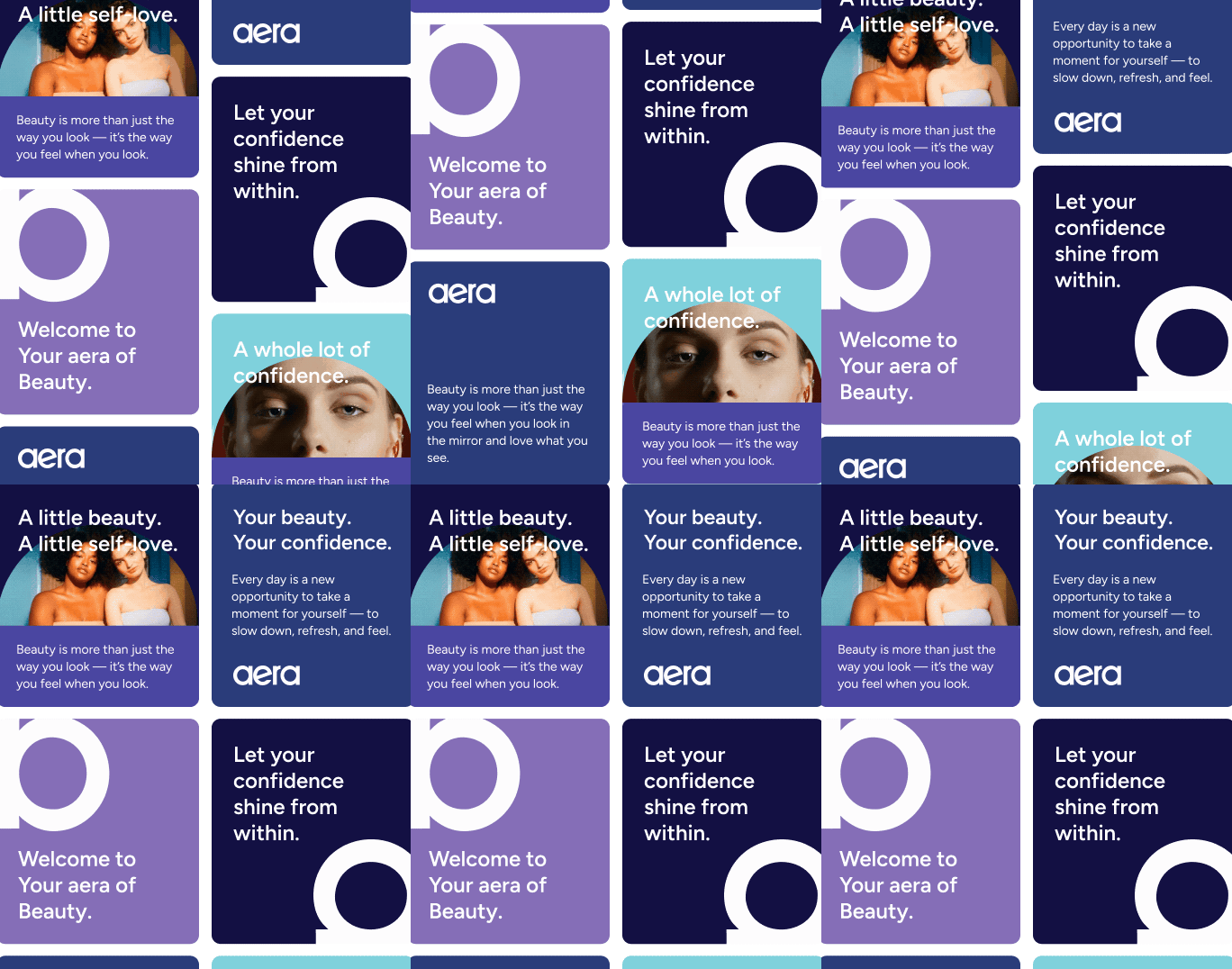
Social posts sit in two columns that drift slowly in opposite directions. Portrait photos in rounded frames, cropped letterforms, and short lines like "Let your confidence shine from within" pass by at a calm pace, so the feed feels continuous rather than busy.
Brand board in motion
Section 4 of 5
One system, moving together
All four panels share the same soft easing and run on one 15-second loop. Seen together, they show how the identity behaves, not just how it looks.
- Easing
- Soft in and out, so every element settles instead of snapping.
- Pace
- Slow drifts and long holds give each message time to land.
- Loop
- Everything returns to the opening frame, so the loop runs without a visible cut.
Reflection
Section 5 of 5
Restraint as a design choice
The hardest part of motion for a calm brand is knowing when to stop. Keeping movement slow and minimal made aera feel confident, because nothing on screen had to compete for attention.