Case studyBranding
A Distinctive Brand Concept for Cohira, a Recruiting Workspace
Project overview
A self-initiated brand identity concept for Cohira, a recruiting workspace that brings hiring teams together, built around clarity and collaboration. Cohira is a fictional brand created for this concept.
4months
From competitor audit to a connected identity system
4sub-brands
Connected through one shared visual language
7competitors
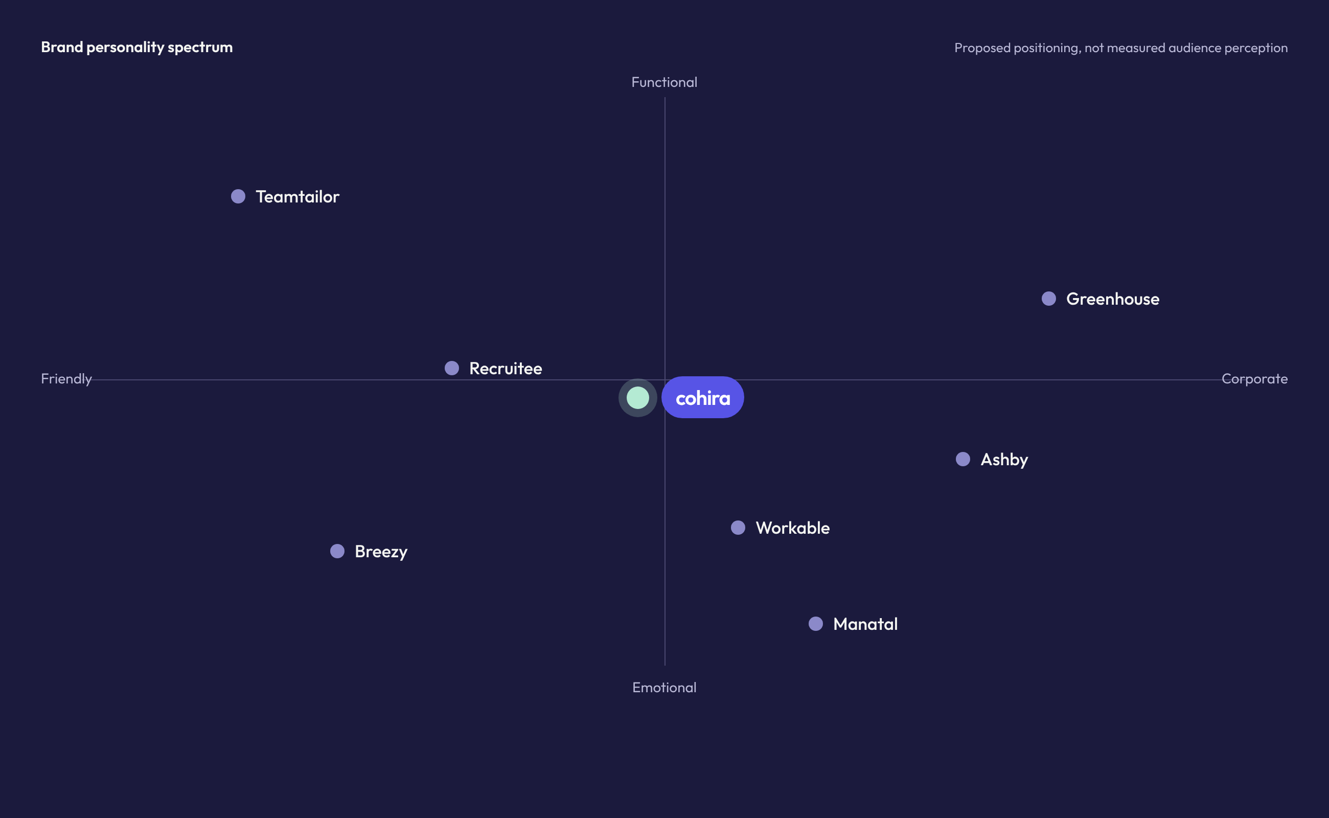
Recruiting platforms mapped on the personality spectrum
Challenge
Section 1 of 7
Understanding the challenge
Recruiting involves multiple people, conversations, and decisions. Cohira needs an identity that reflects this complexity with clarity while keeping the human side of hiring visible.
The challenge is to build a distinctive brand that feels organized, collaborative, and intuitive.
- Problem
- Hiring involves many people, conversations, and decisions.
- Need
- An identity that brings clarity to that complexity while keeping the human side of hiring visible.
- Goal
- A distinctive brand that feels organized, collaborative, and intuitive.
Approach
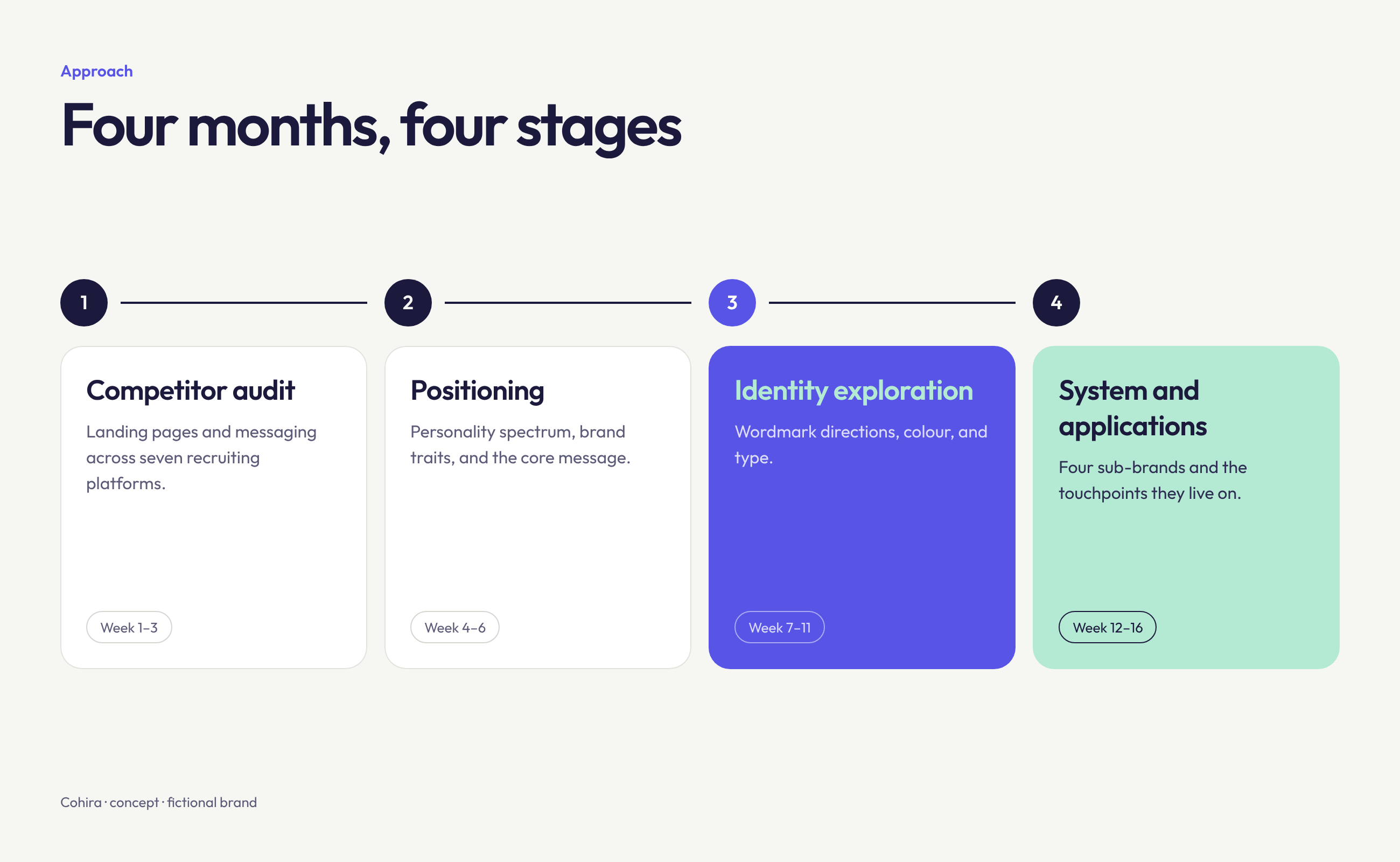
Four months, in four stages.
- 1Competitor auditLanding pages and messaging across recruiting platforms
- 2PositioningPersonality spectrum, brand traits, and core message
- 3Identity explorationWordmark directions, colour, and type
- 4System and applicationsFour sub-brands and the touchpoints they live on
Positioning
Section 2 of 7
Finding Cohira’s place among recruiting platforms
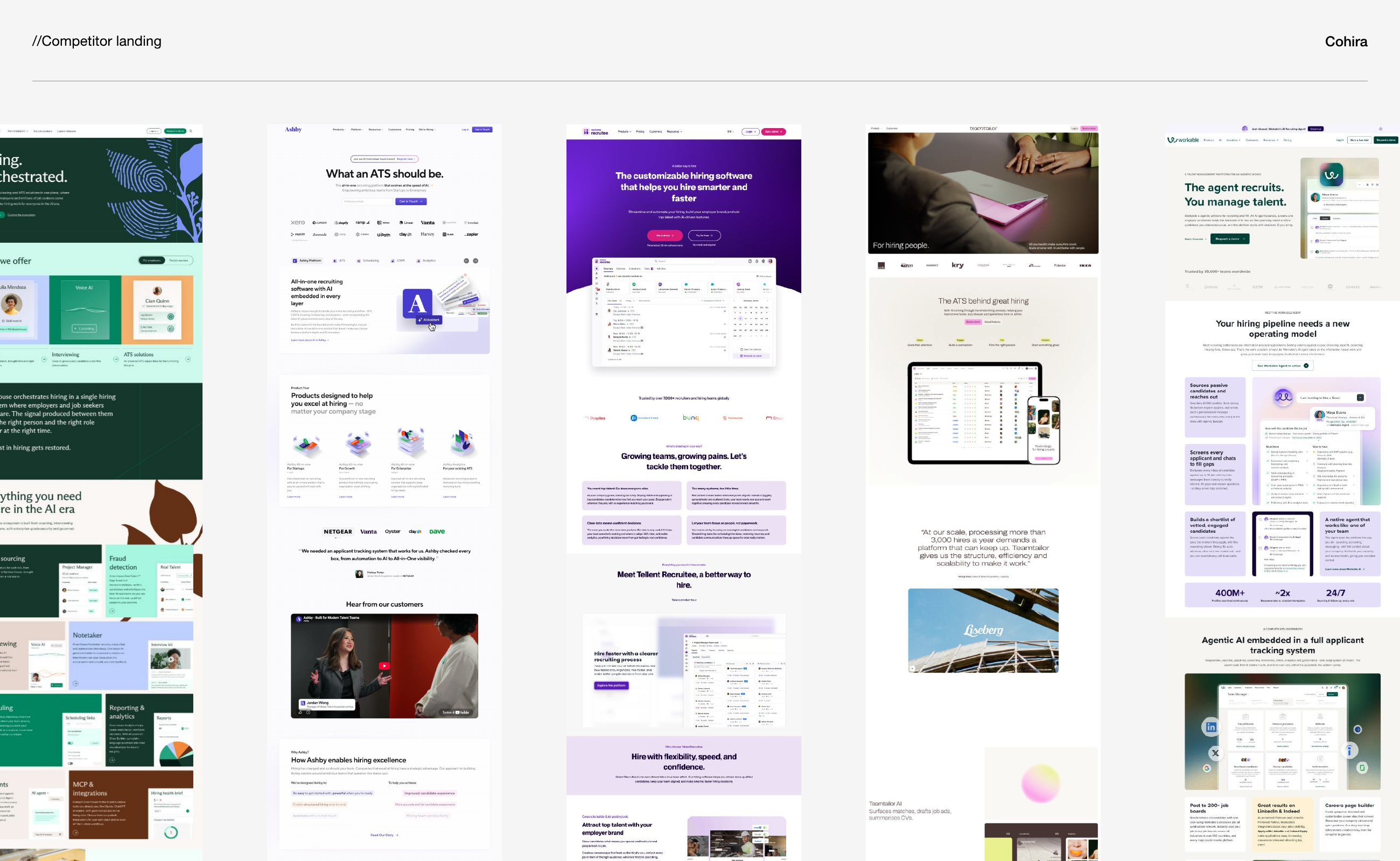
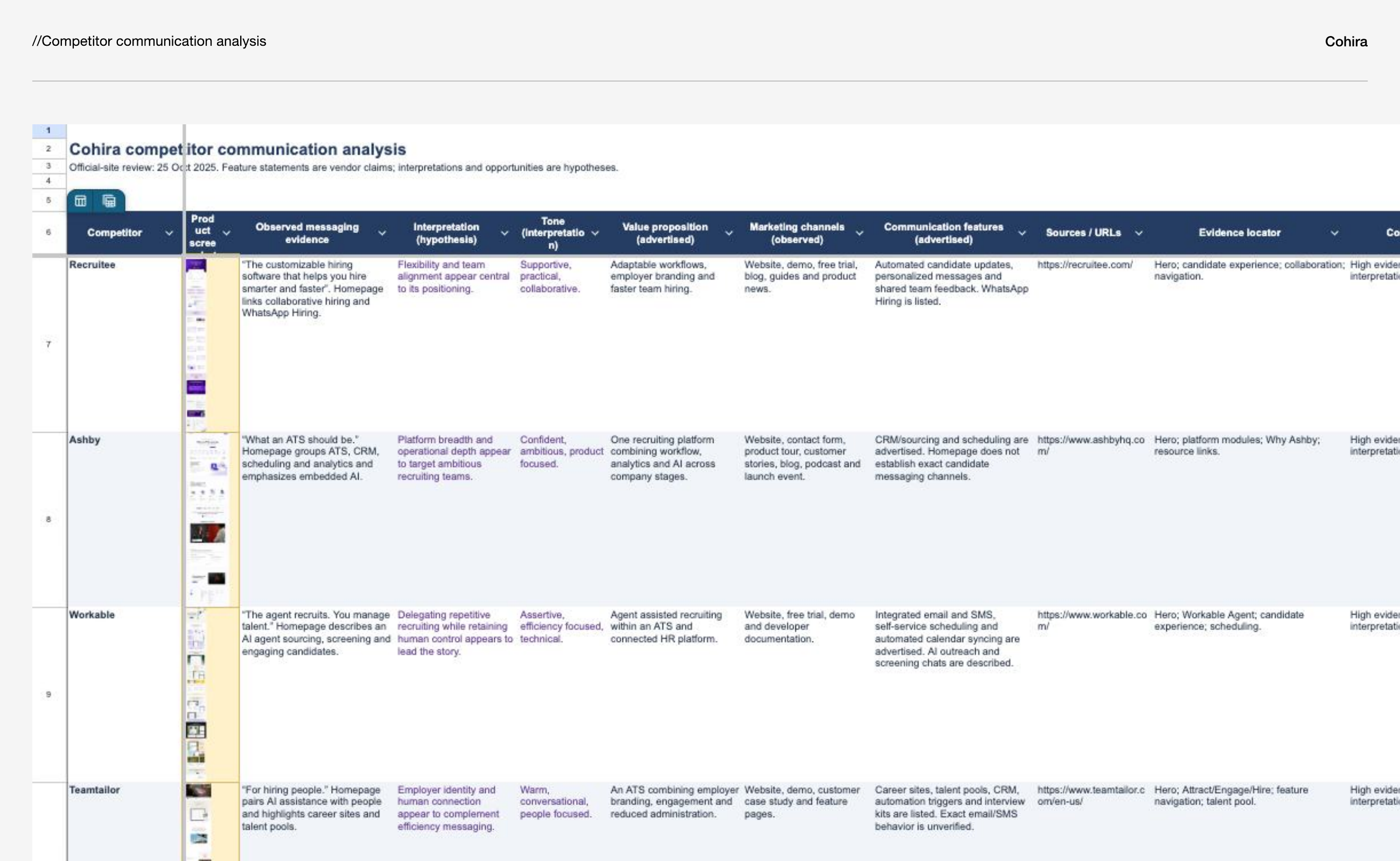
An audit of competitor landing pages and messaging mapped recruiting platforms such as Teamtailor, Greenhouse, Recruitee, Ashby, Workable, Breezy, and Manatal on a personality spectrum, from friendly to corporate and from functional to emotional. The proposed positioning places Cohira between Recruitee and Ashby, slightly closer to Recruitee.
- Friendly, not corporate
- Approachable for recruiters and hiring managers, not complex enterprise software.
- Functional, still human
- Messaging built on efficiency, transparency, and collaboration without losing the human side of hiring.
- Professional, not technical
- Ashby’s clarity, without the technical language.
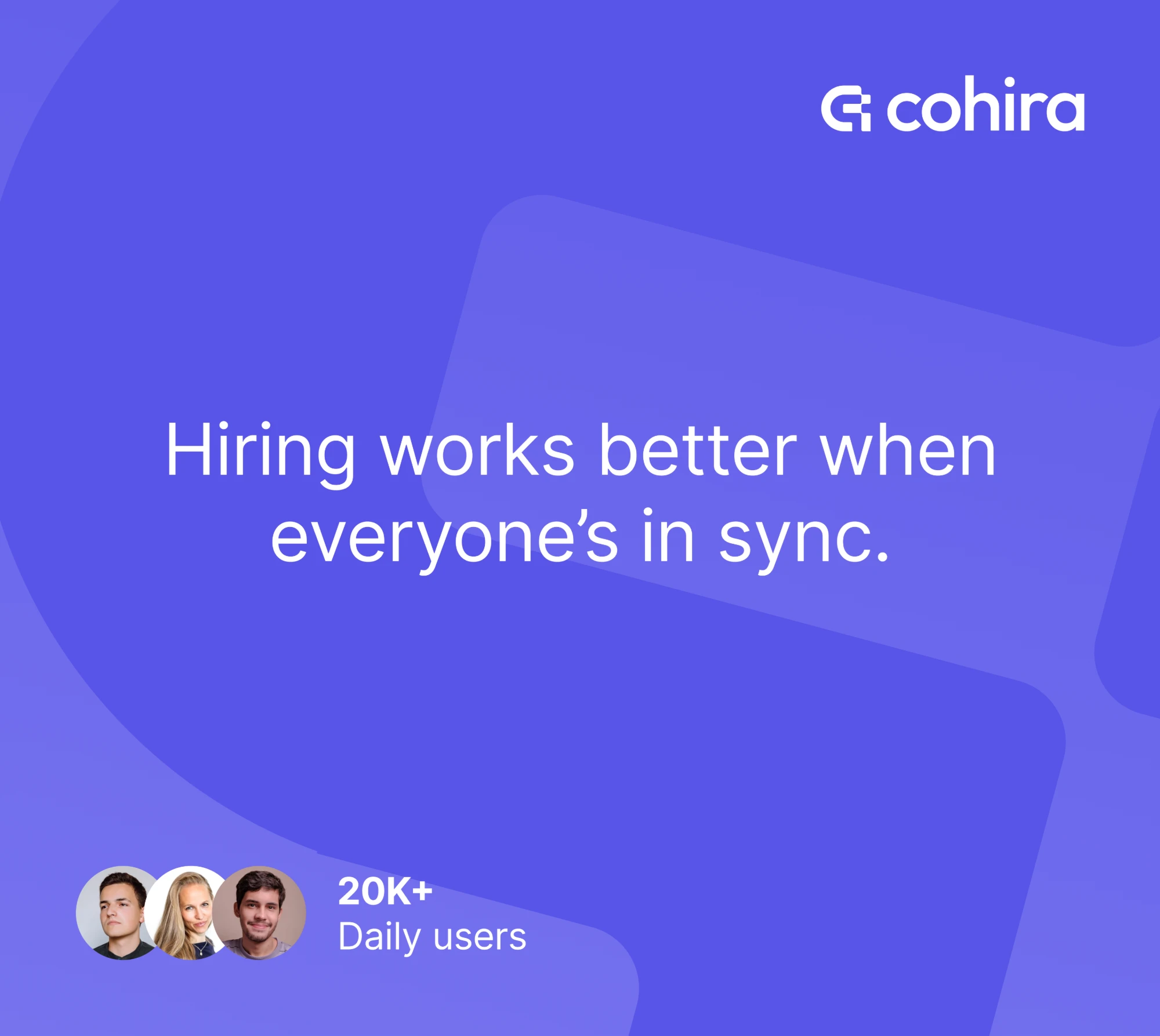
Hiring works better when everyone’s in sync.
Bring your team, candidates, and hiring decisions together in one simple workspace. The personality behind it: collaborative, approachable, clear, reliable, and modern.
Identity exploration
Section 3 of 7
From four explorations to one connected mark
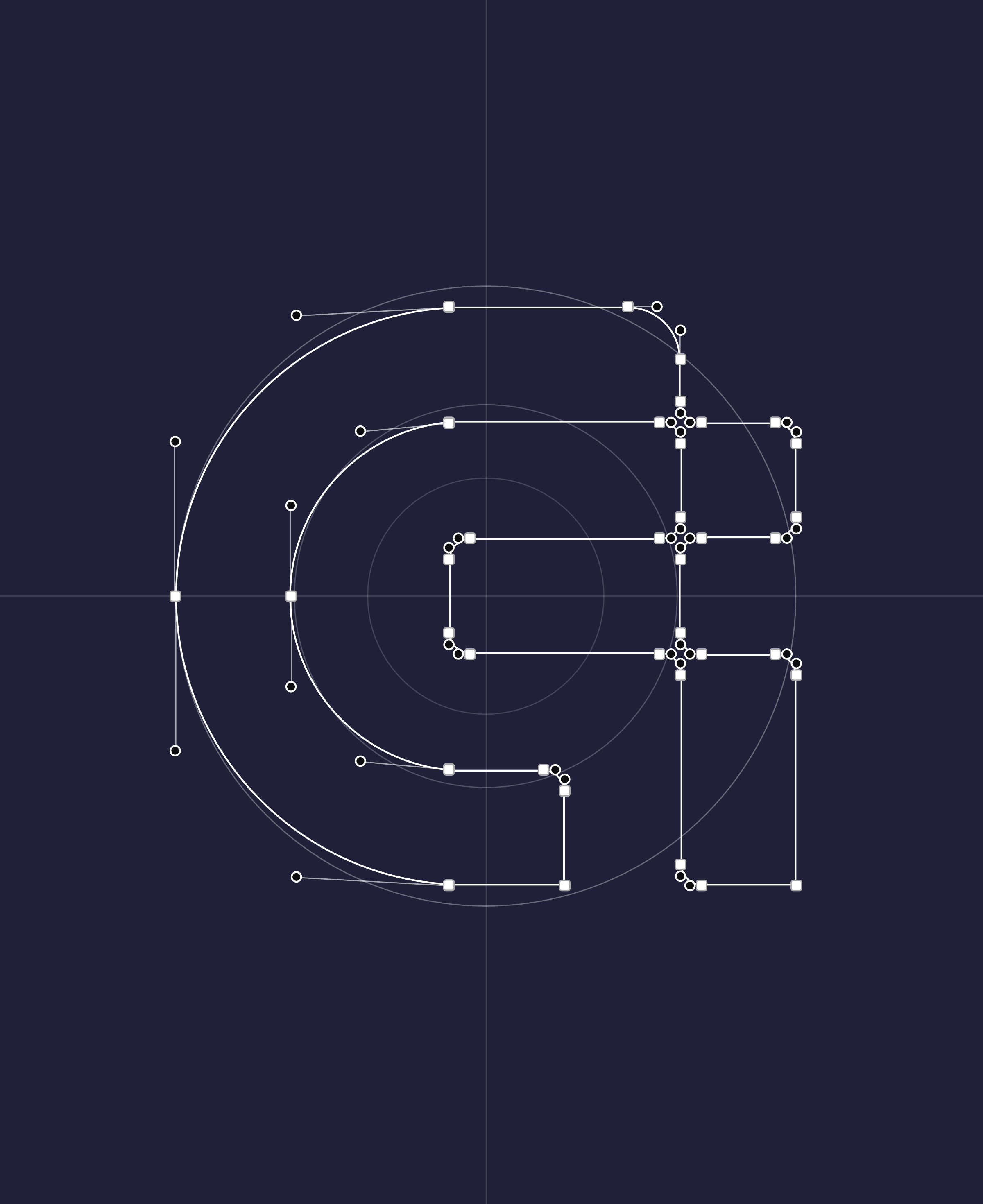
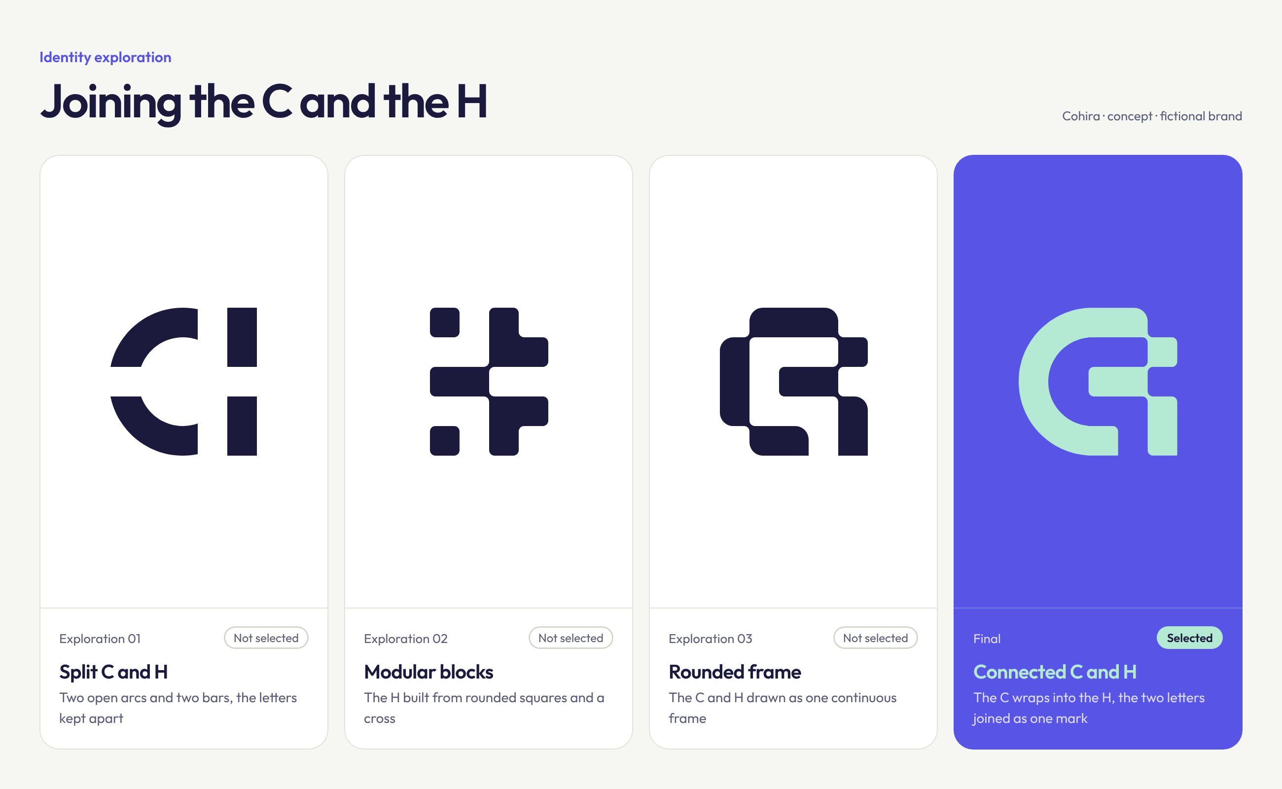
The logomark started from one idea: joining the C and the H of Cohira, the same way the product brings everyone in hiring together. Three directions were explored and set aside: a split C and H, a modular mark built from rounded squares, and a continuous rounded frame. The selected mark wraps the C into the H as a single shape.
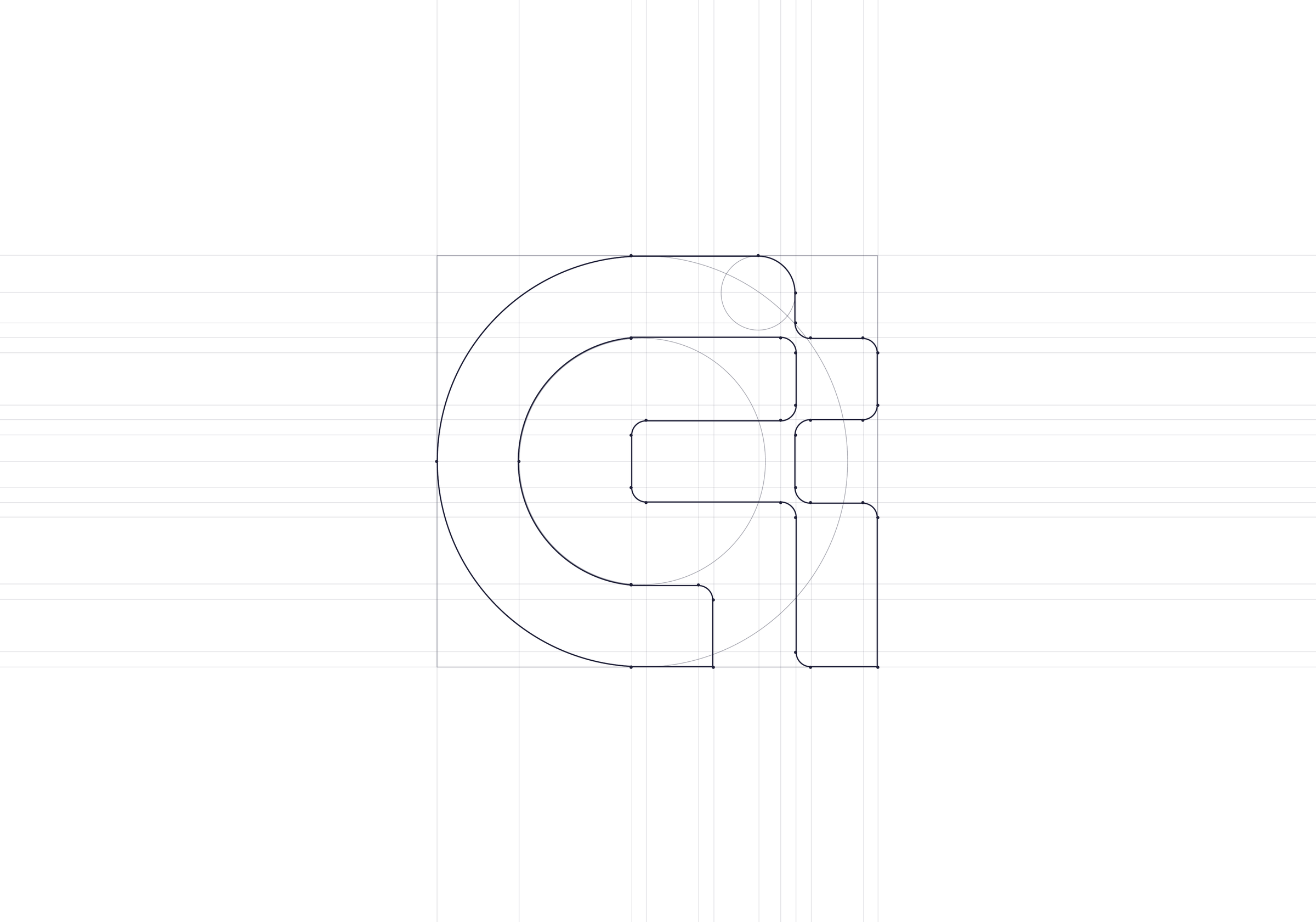
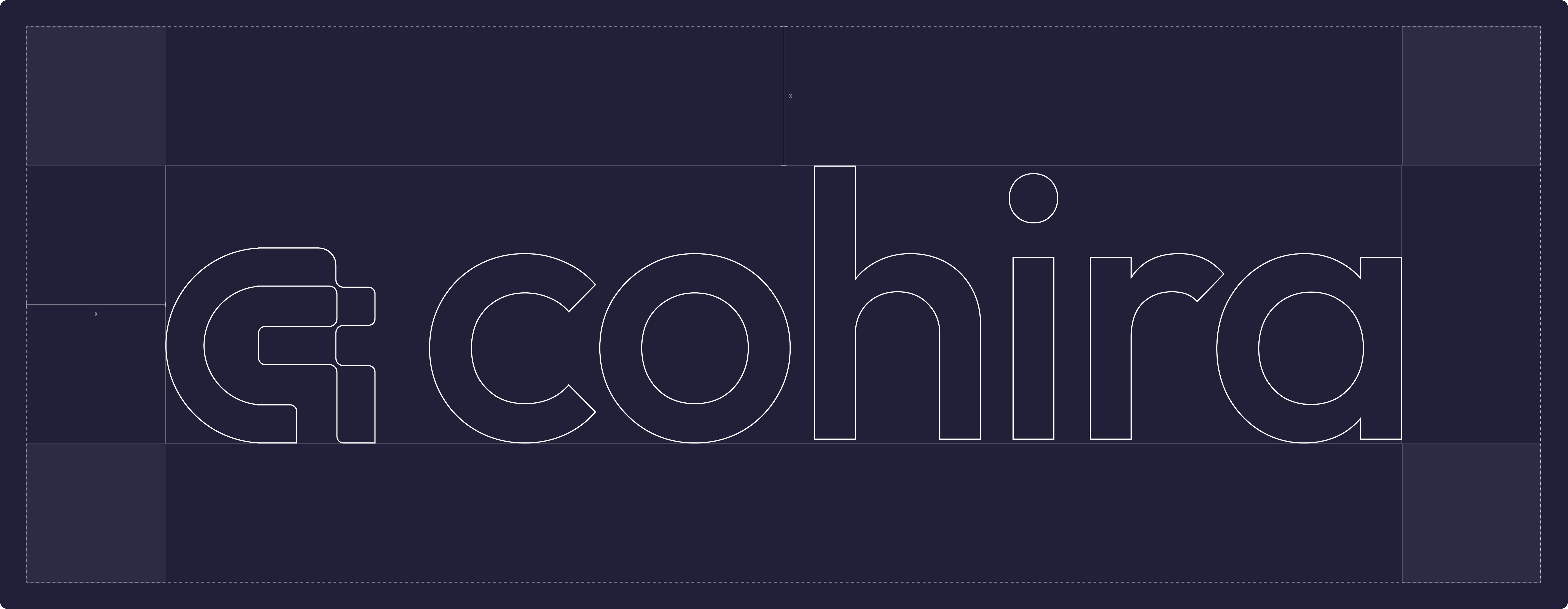
The mark is built on concentric circles and a shared grid, with corner radii that echo the rounded forms of the Outfit wordmark. A fixed unit, x, sets the clear space around the full lockup.
Brand system
Section 4 of 7
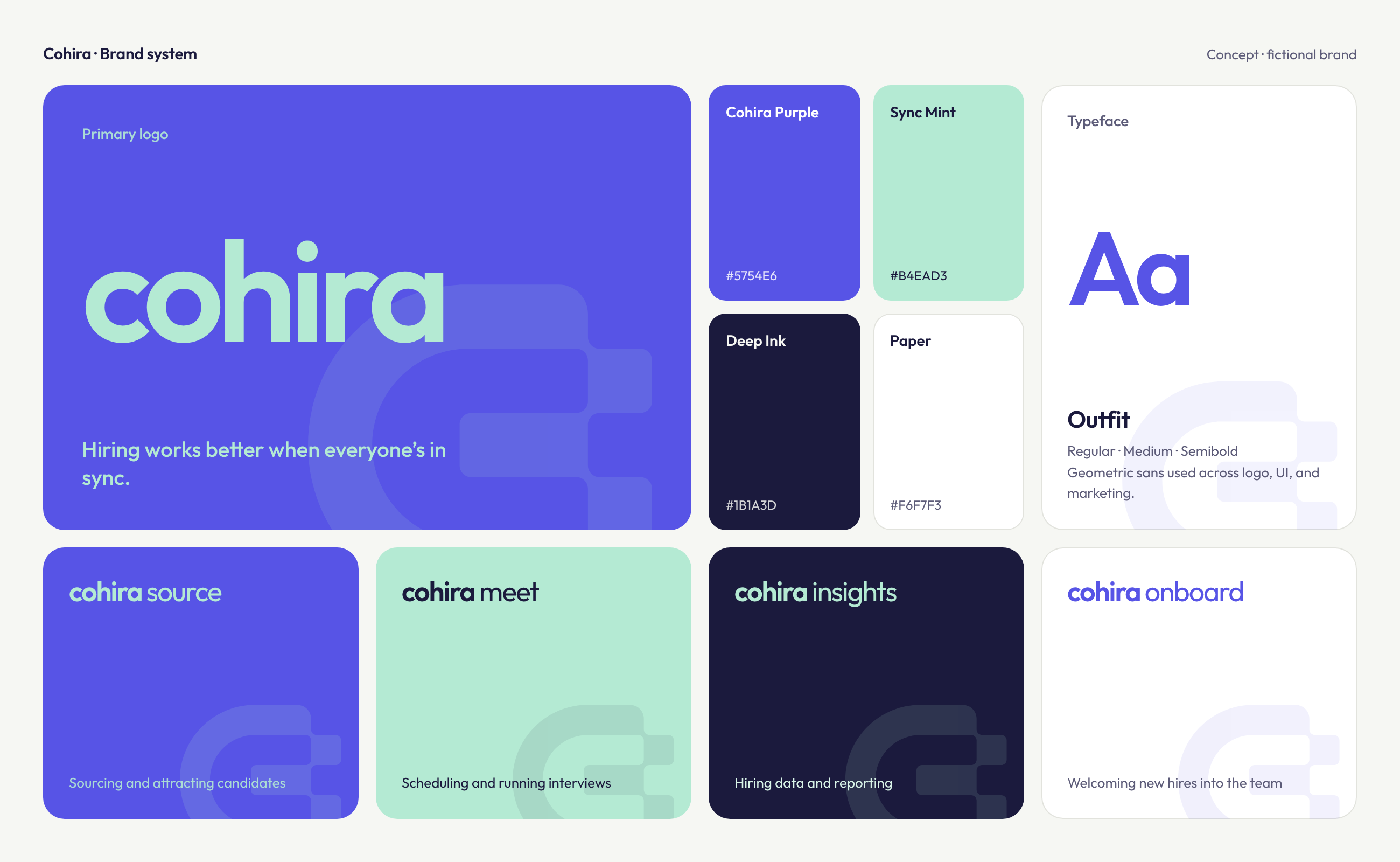
One Brand. Connected Products.
Cohira’s sub-brands support every stage of hiring, each with a distinct identity connected through a shared visual language.
The visual language is modern and friendly, and built to scale: the same colours and type carry from the marketing site into a product dashboard.
- Cohira Source
- Sourcing and attracting candidates.
- Cohira Meet
- Scheduling and running interviews.
- Cohira Insights
- Hiring data and reporting for better decisions.
- Cohira Onboard
- Welcoming new hires into the team.
Voice
Section 5 of 7
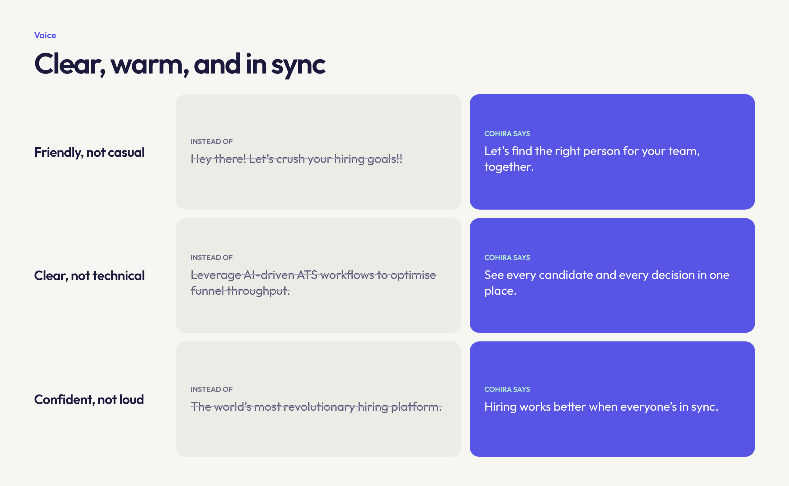
Clear, warm, and in sync
Cohira speaks the way a good hiring partner would: clear enough to act on, and warm enough to keep the people in hiring at the centre.
- Friendly, not casual
- Warm and approachable, but still credible for hiring decisions.
- Clear, not technical
- Plain language over HR and software jargon.
- Confident, not loud
- Says what the product does, without hype.
Applications
Section 6 of 7
Cohira in use
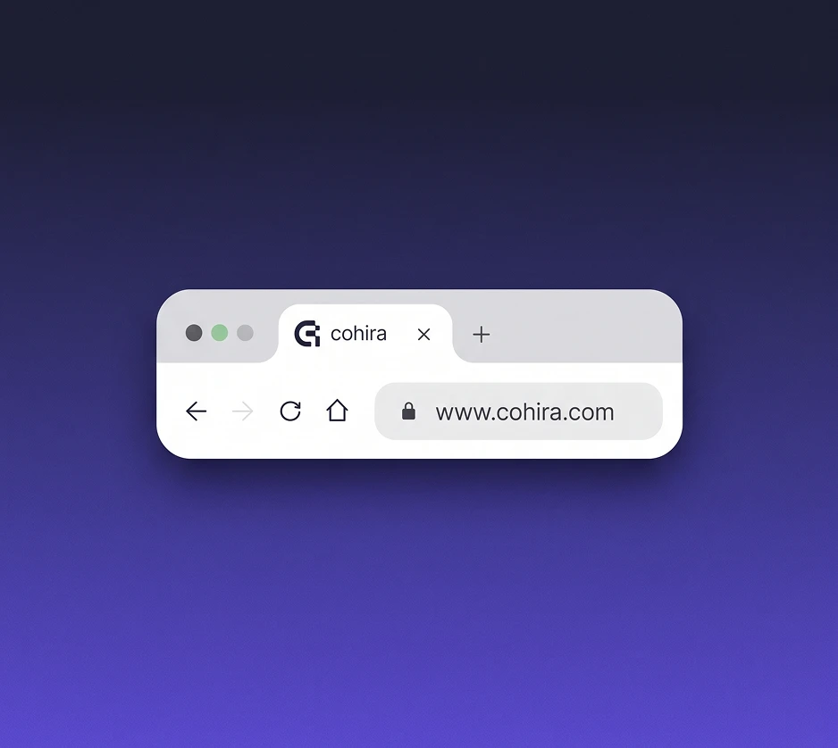
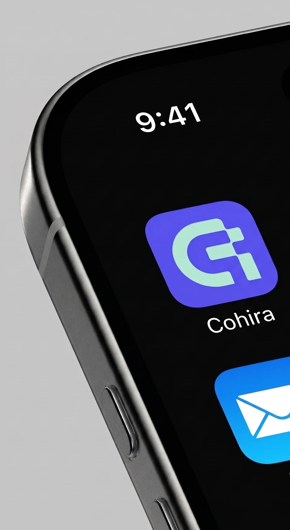
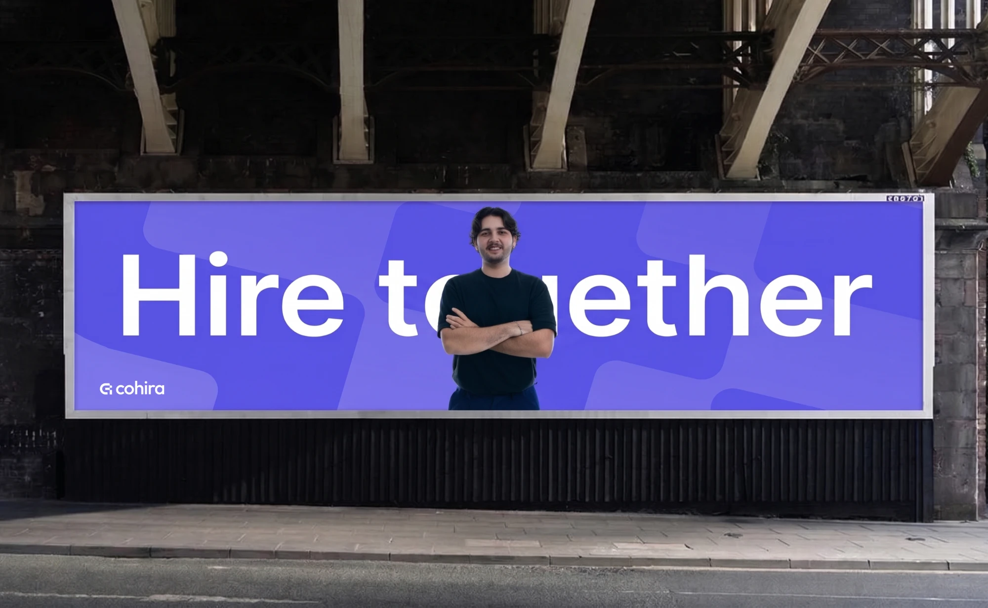
Cohira lives on the screens hiring teams open every day, from a browser tab and a home-screen icon to a notification badge, and carries the same look into a video intro, a social profile, social ads, and an outdoor billboard.


Reflection
Section 7 of 7
What I would validate next
This is a concept, so the positioning is a recommendation rather than a tested result. The next step would be to put it in front of recruiters and hiring managers, checking whether the brand reads as friendly and clear, and to test the palette for accessibility inside a data-heavy dashboard.
If the main audience were enterprise HR teams, I would move the positioning closer to Ashby and Greenhouse: more structured and more formal.
Testimonial
“Satrio is a skilled UI/UX designer with strong Figma expertise, delivering functional and appealing designs. He communicates clearly, works well remotely, and consistently contributes creative, business-focused solutions.”