Case studyBranding
A Calmer Way to See Your Money: Brand Identity for Kindcount
Project overview
Money apps are full of numbers but rarely feel reassuring. In this self-initiated concept, I designed an identity for Kindcount, a fictional personal finance app, around one idea: money should feel calm to look at.
3months
Three months, from moodboard to a finished system
4colours
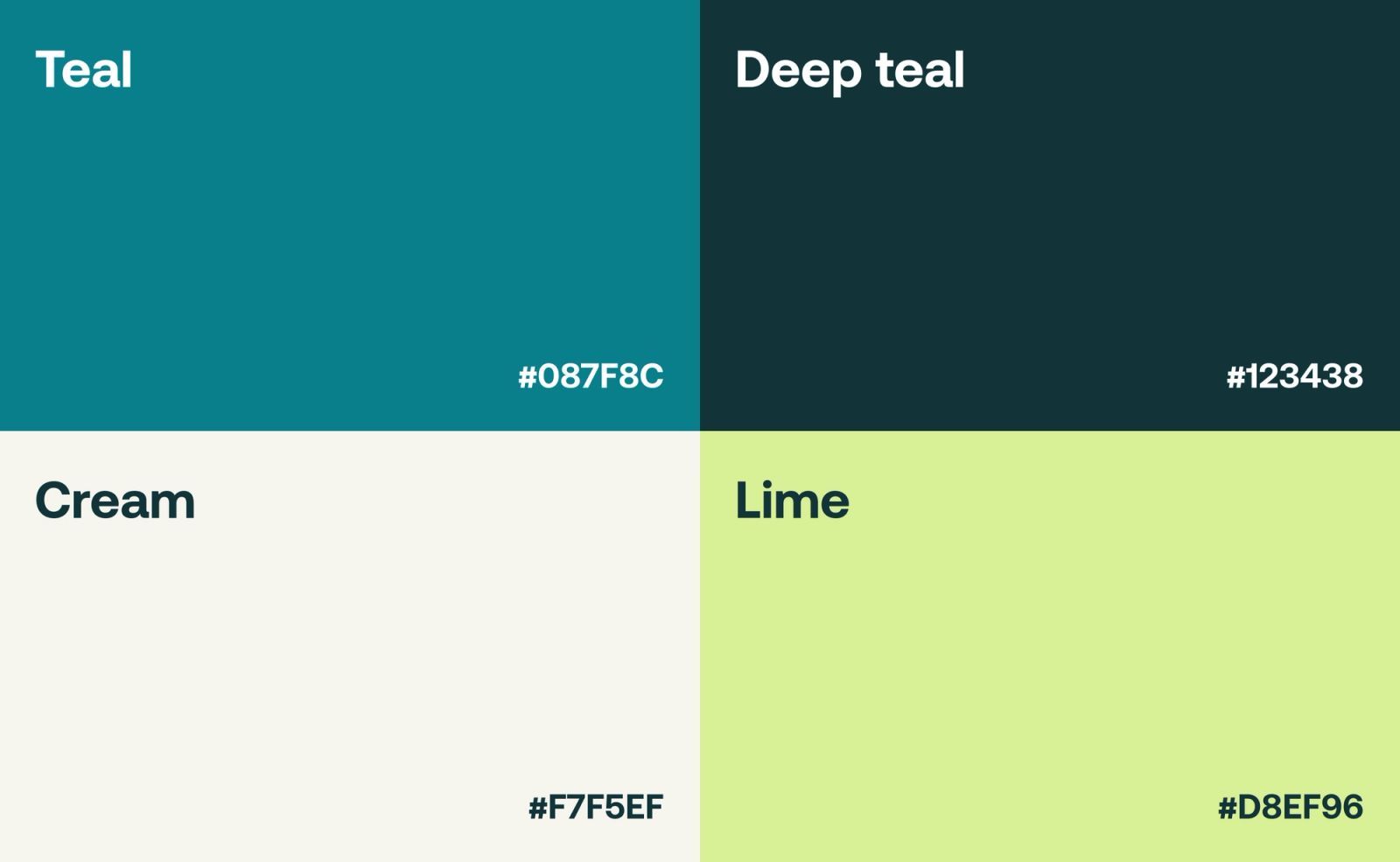
A small palette: teal, deep teal, cream, and lime
7touchpoints
Tested on screens, wrists, and merchandise
The problem
Section 1 of 7
Why money feels hard to read
Scattered transactions, unfamiliar terms, and competing priorities make personal finance tiring to manage, and most money apps answer with more numbers rather than more reassurance.
Kindcount needed an identity that earns trust quickly and makes everyday money feel approachable, staying readable and consistent from the app to its marketing.
- The friction
- Scattered transactions and unfamiliar terms make people avoid looking at their money.
- The brief
- A recognisable identity that signals trust at a glance, on any screen.
- The feeling
- Calm, clear, and quietly encouraging, never cold or alarming.
Mood
Section 2 of 7
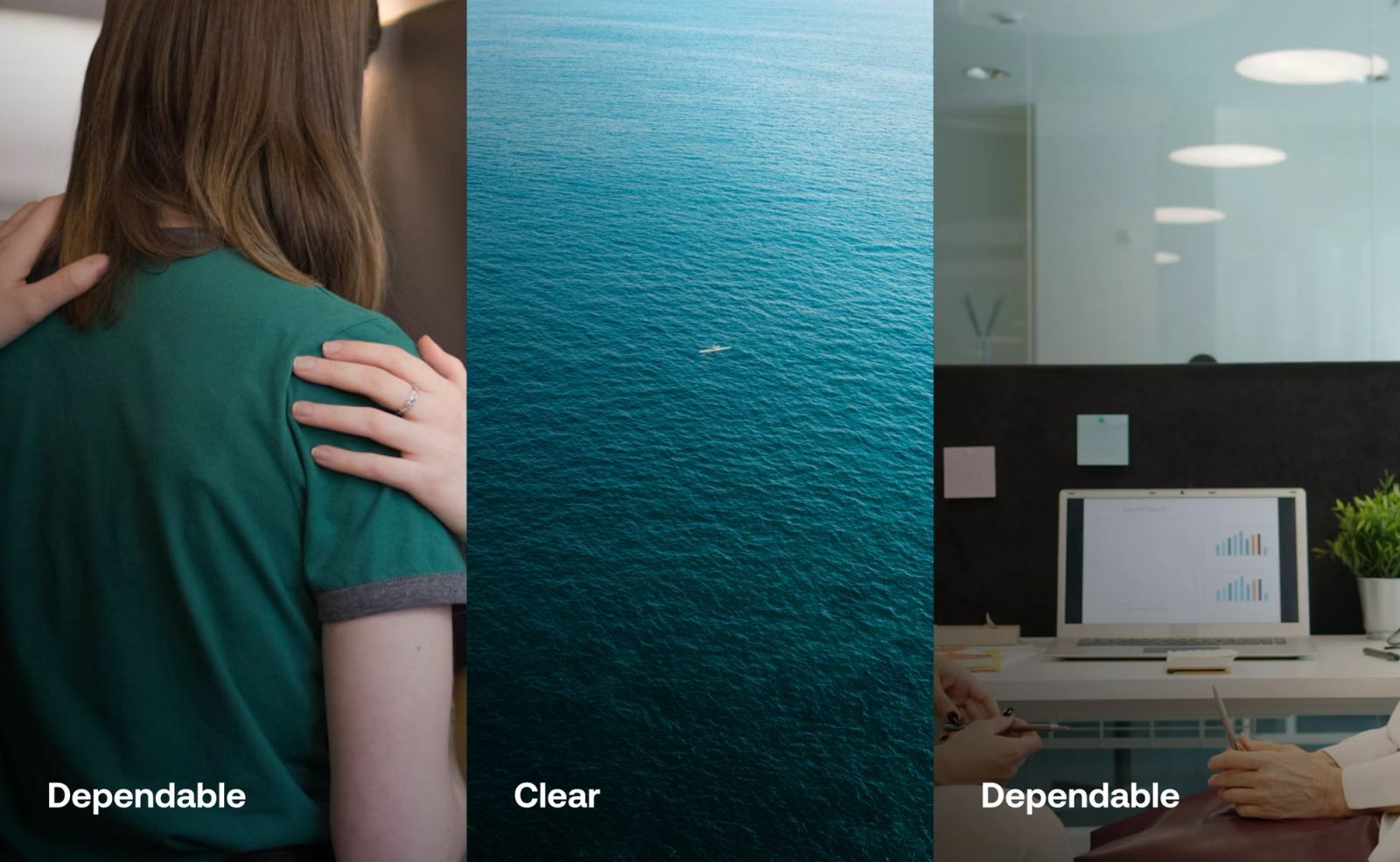
Dependable, clear, and quietly warm
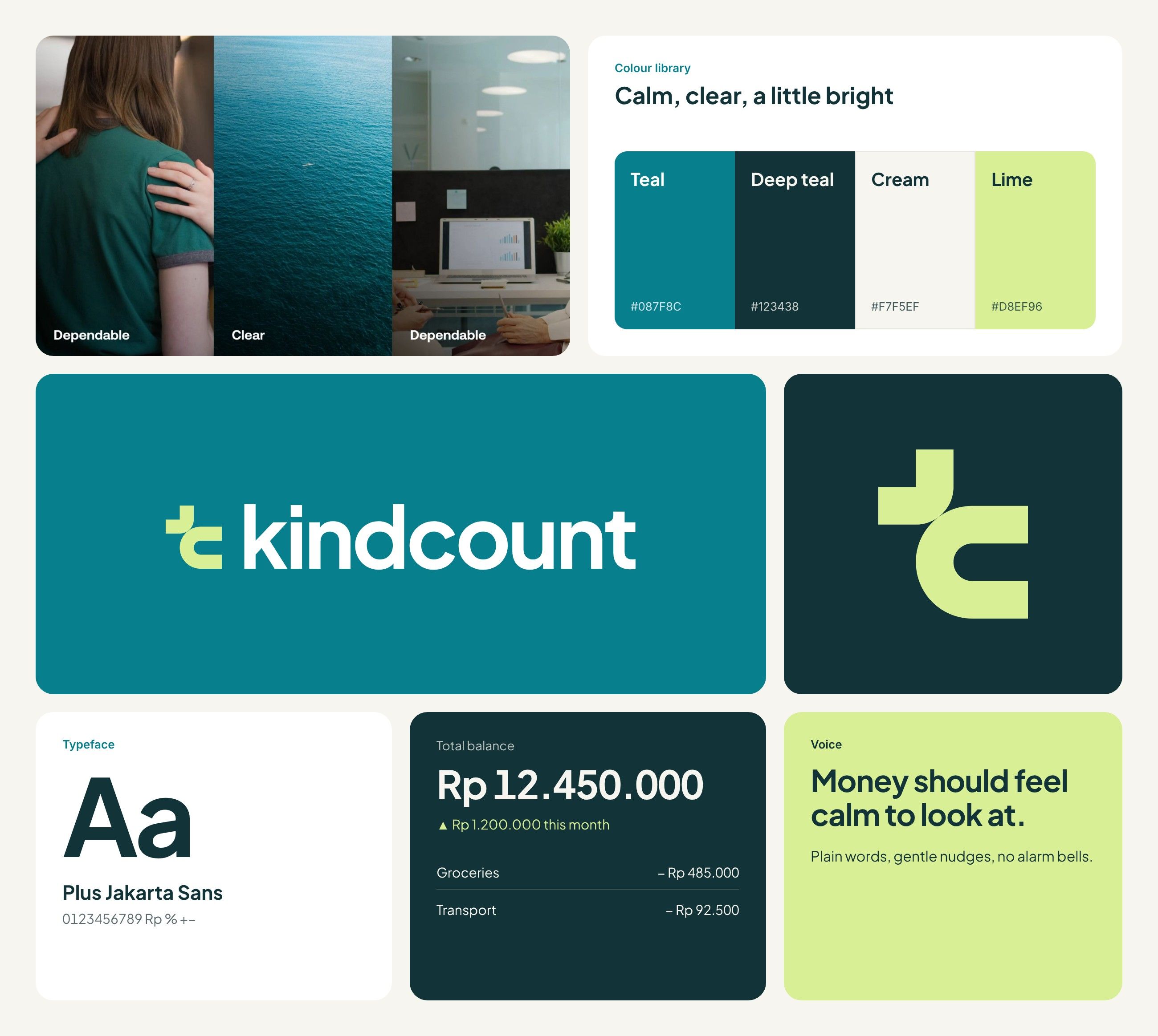
The moodboard settled on two words, dependable and clear. Teal and deep teal set a steady base, cream keeps screens soft, and lime adds a bright accent.
Typeface
Section 3 of 7
Numbers that feel friendly
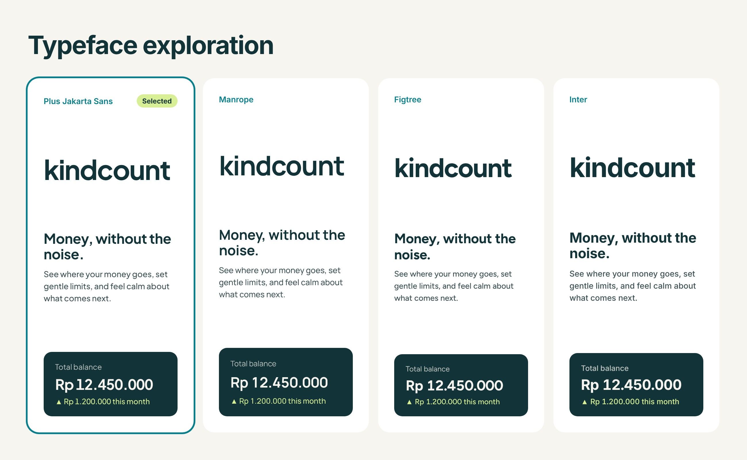
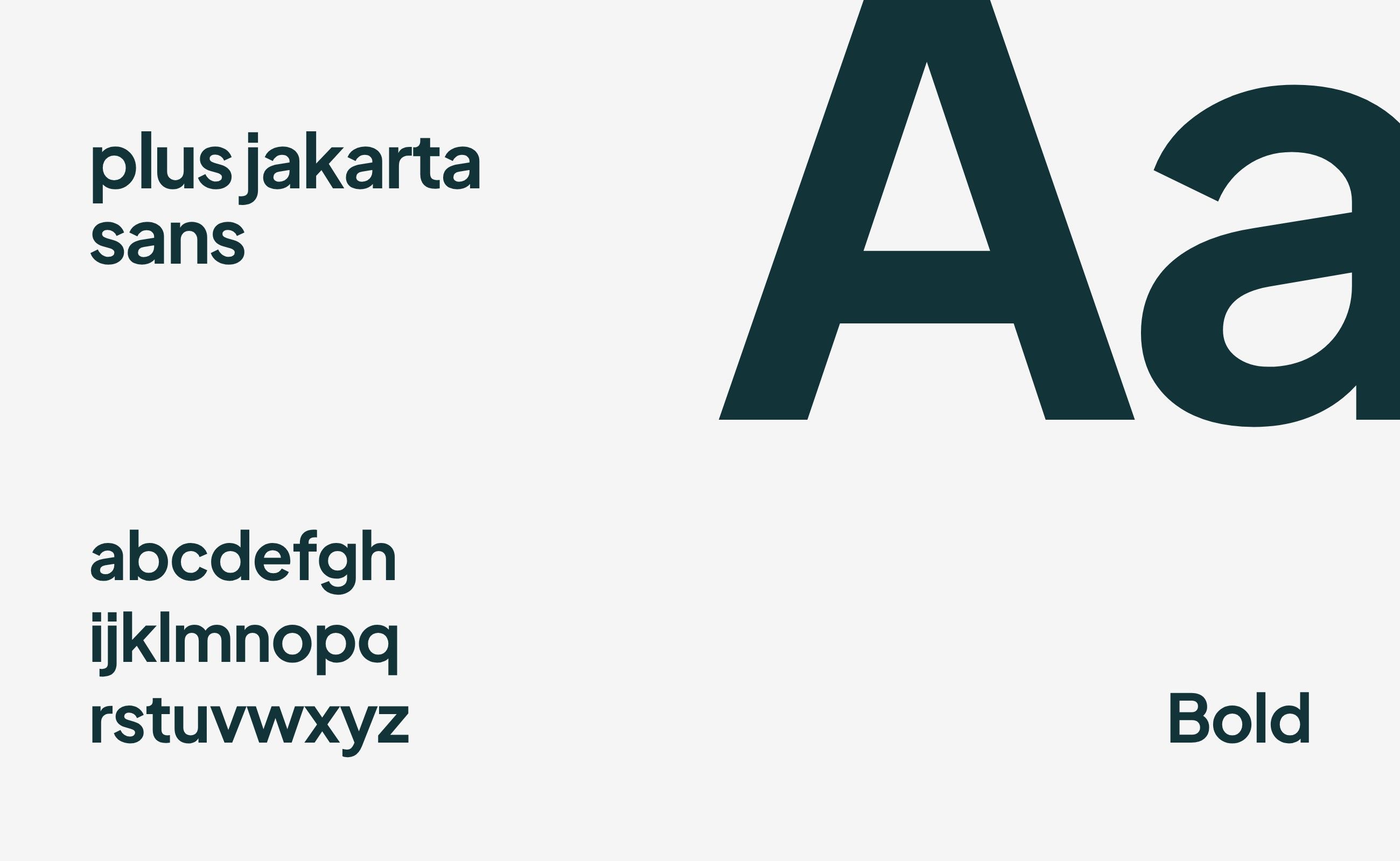
Four typefaces were tested on the wordmark, a headline, and a real balance. Plus Jakarta Sans was chosen: warm in the wordmark, and clear in the numbers people check every day.
Shaping the mark
Section 4 of 7
One rounded mark
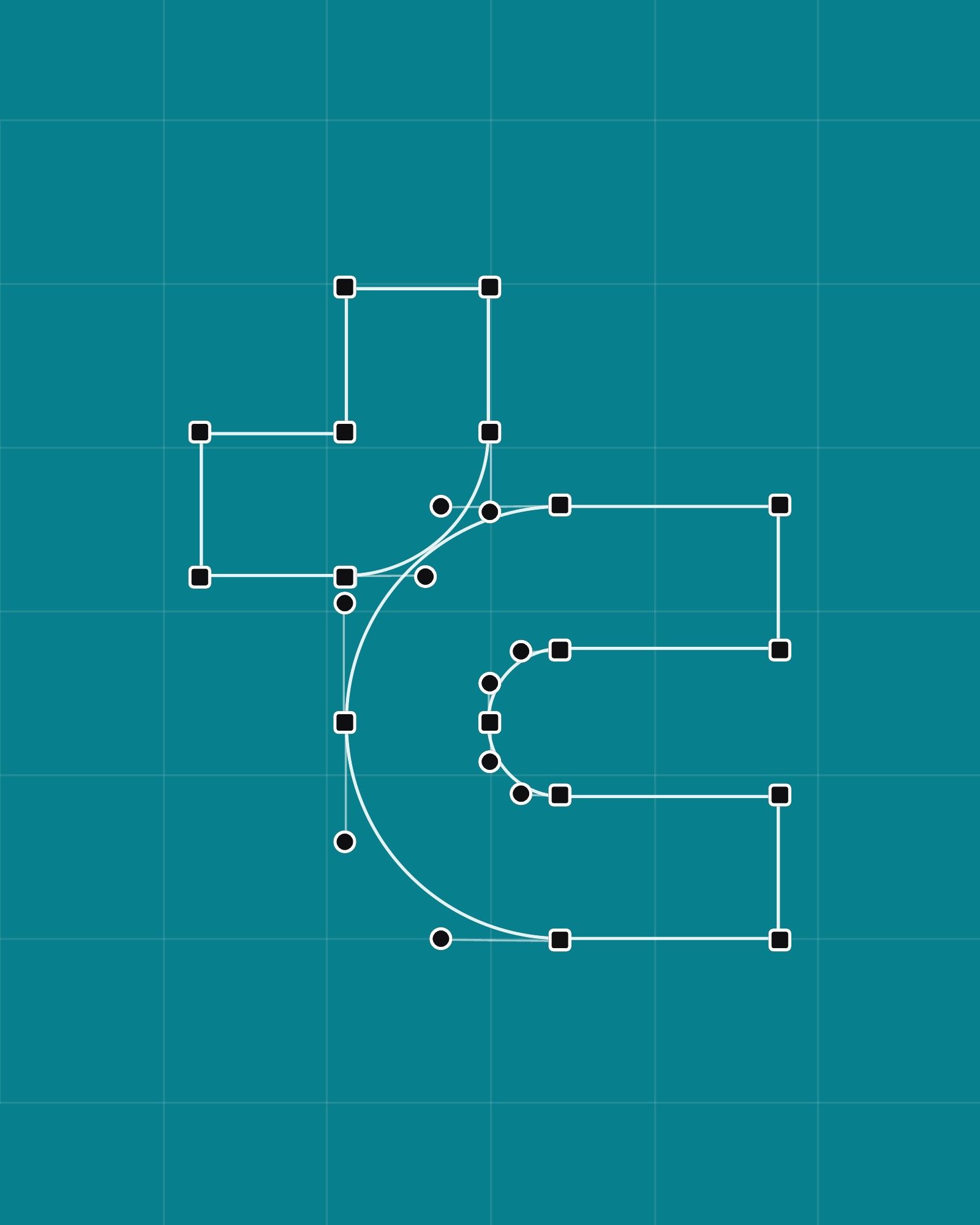
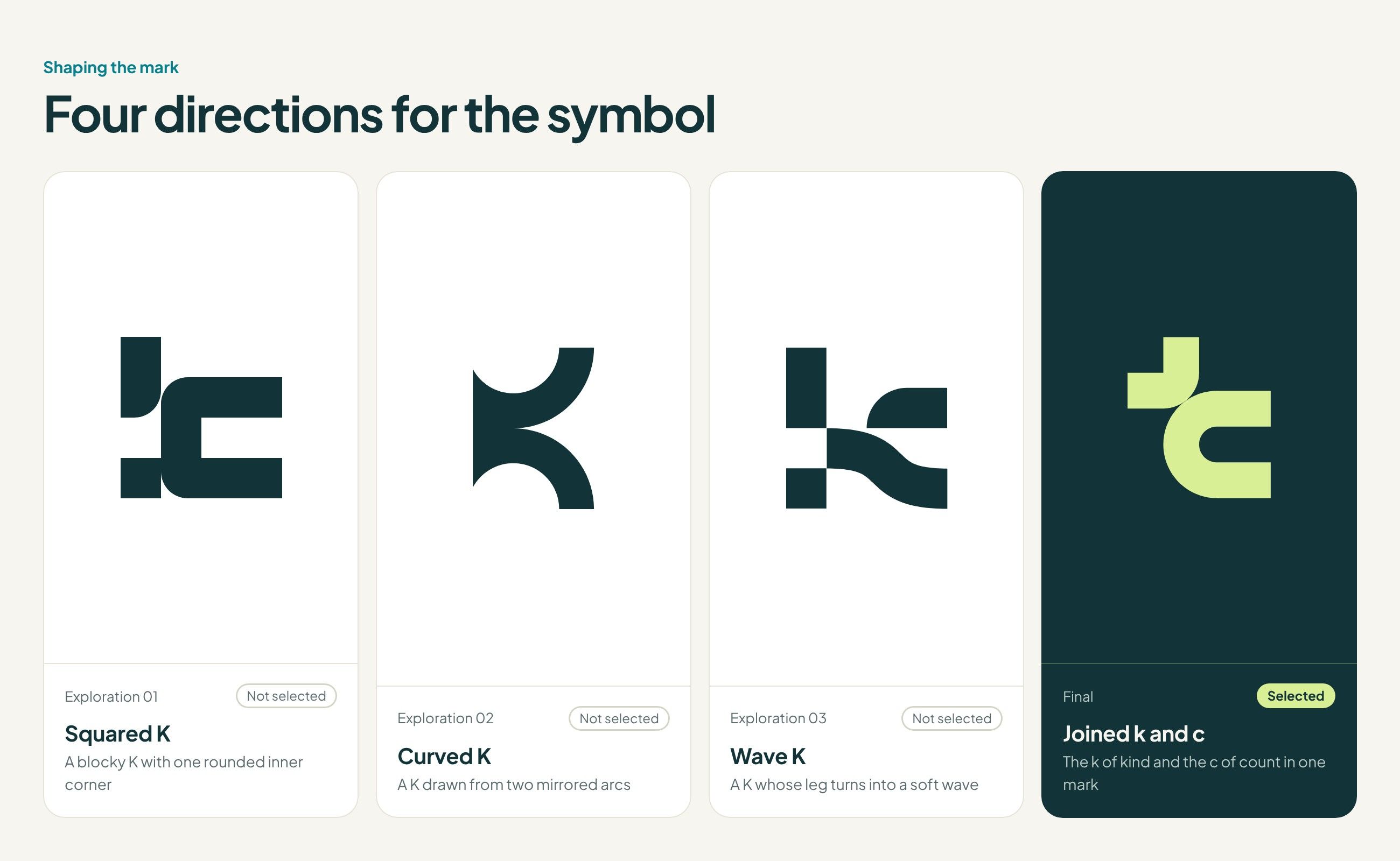
I explored four directions for the symbol, each built from the K of Kindcount. The final mark joins the k of kind and the c of count, refined on a construction grid.


System
Section 5 of 7
A mark that works on any background
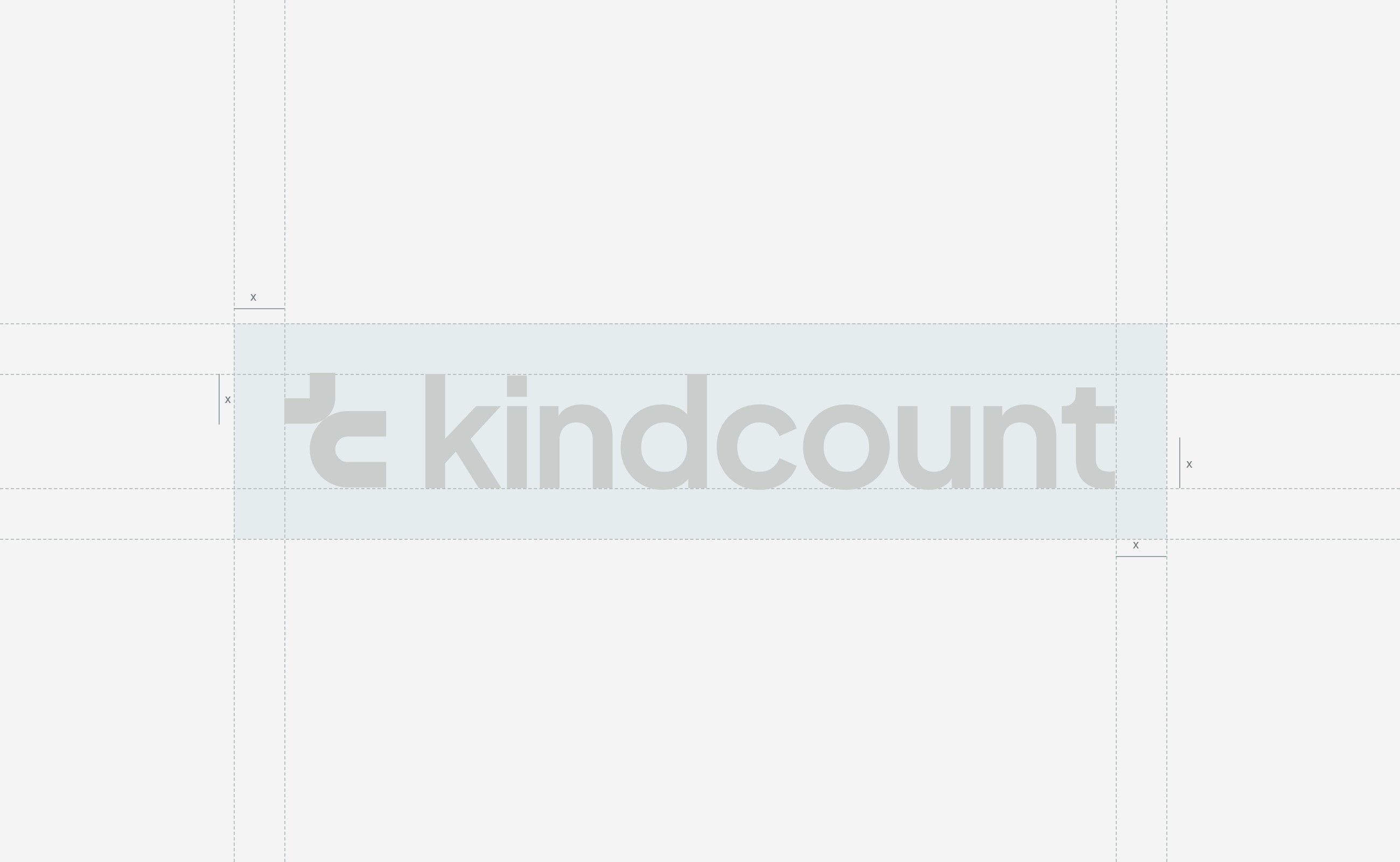
Lime symbol, deep teal wordmark. Measured construction and clear-space rules keep the pairing consistent on light, monochrome, and dark backgrounds.




Touchpoints
Section 6 of 7
From app icon to tumbler
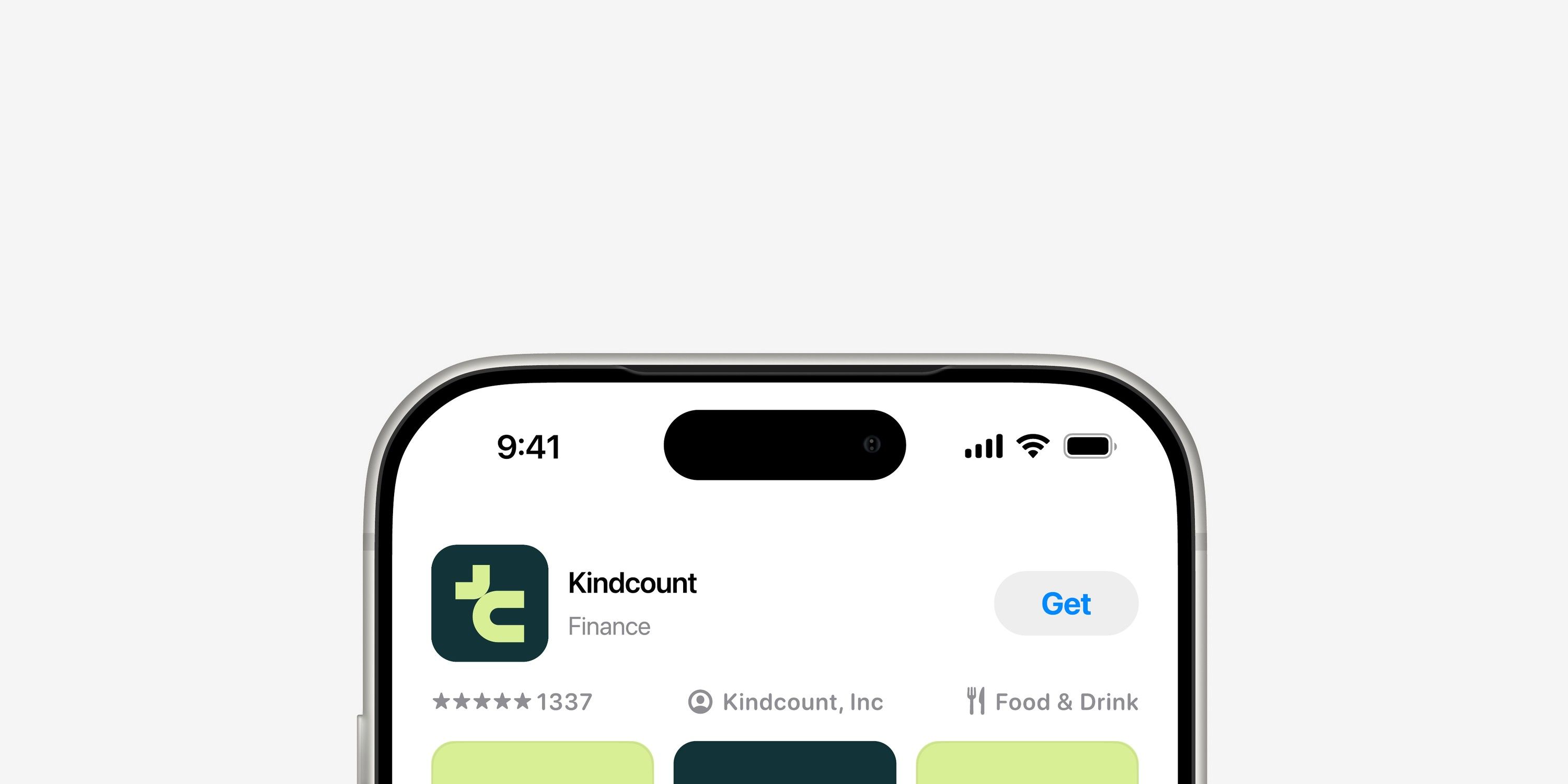
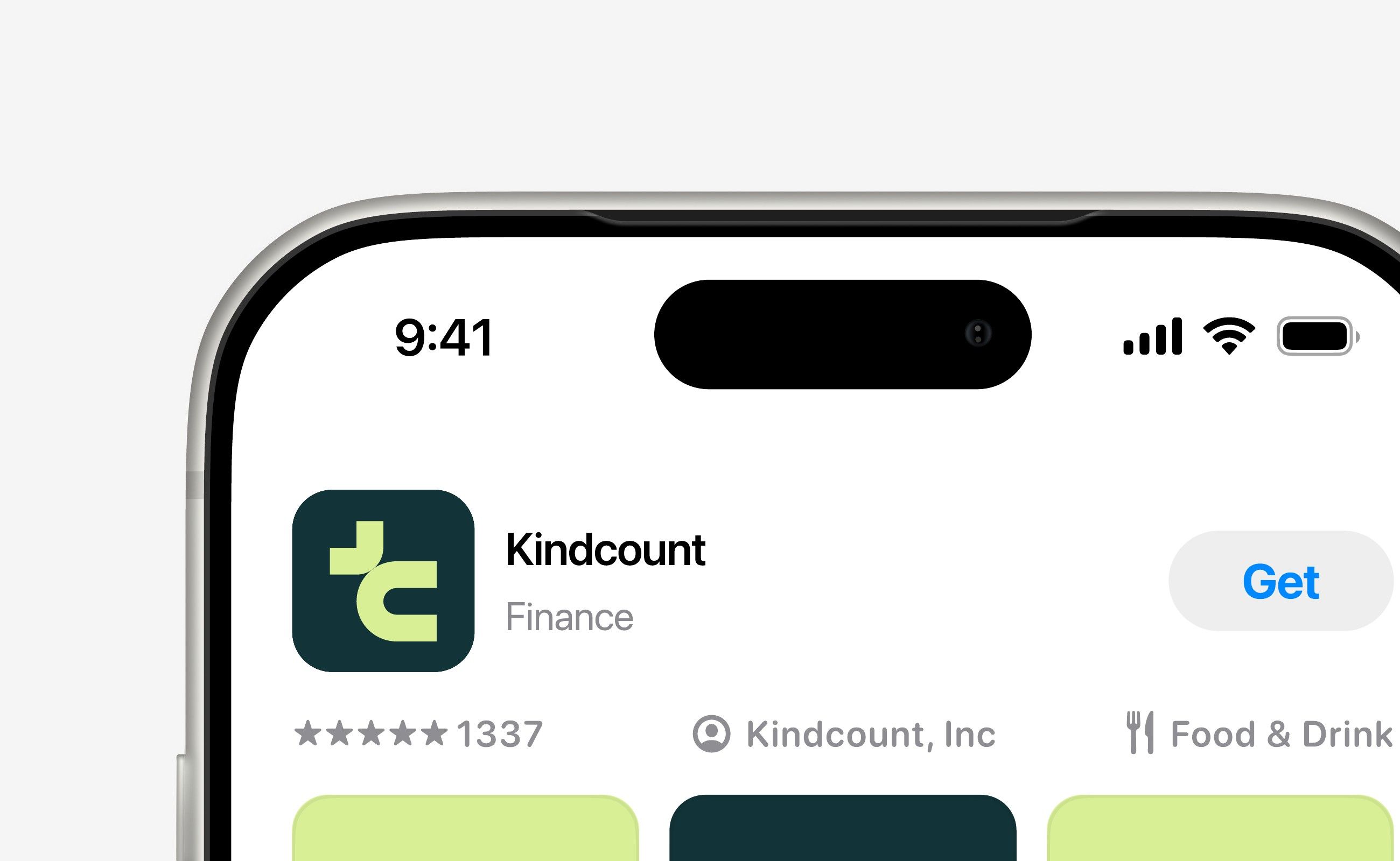
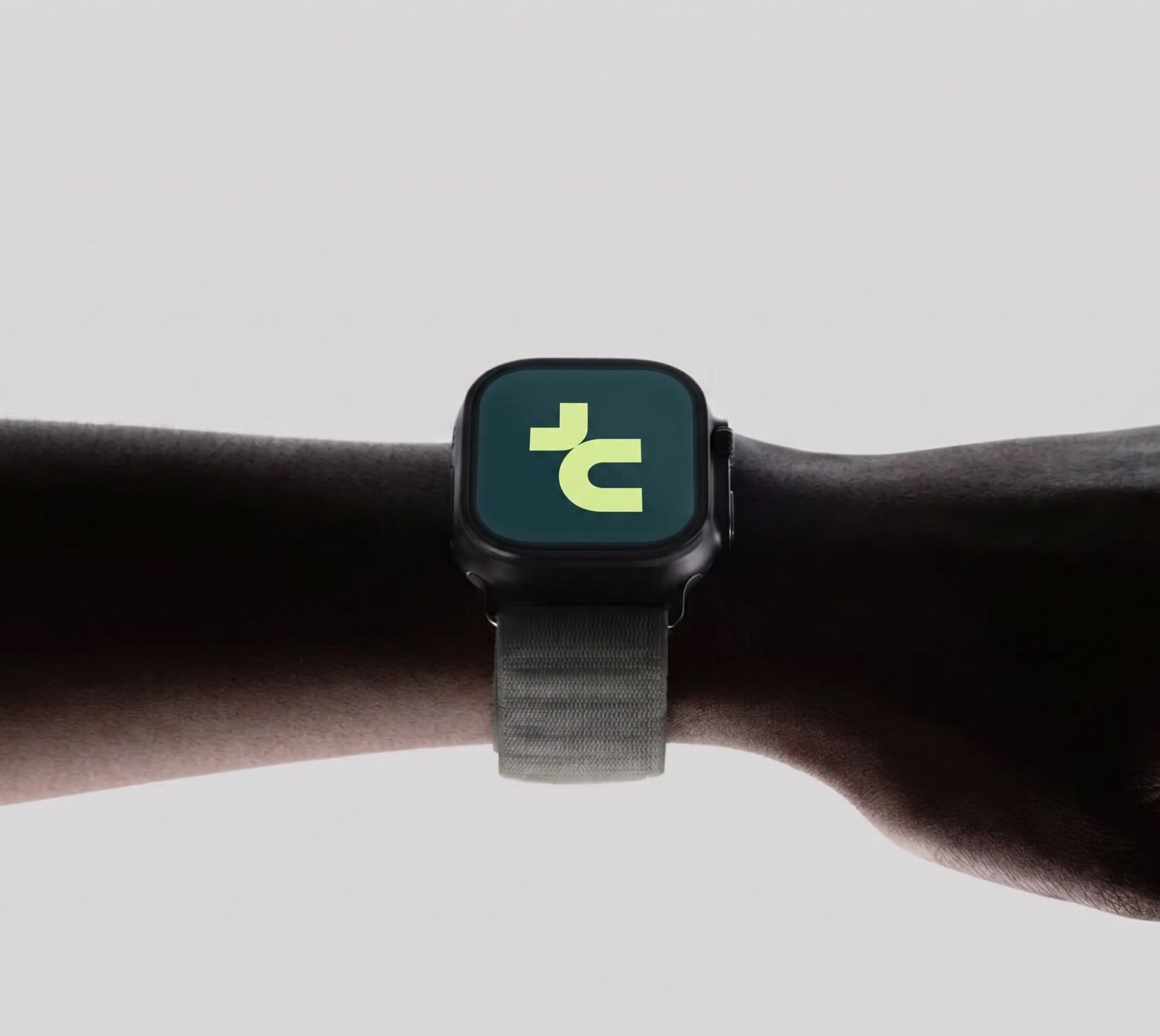
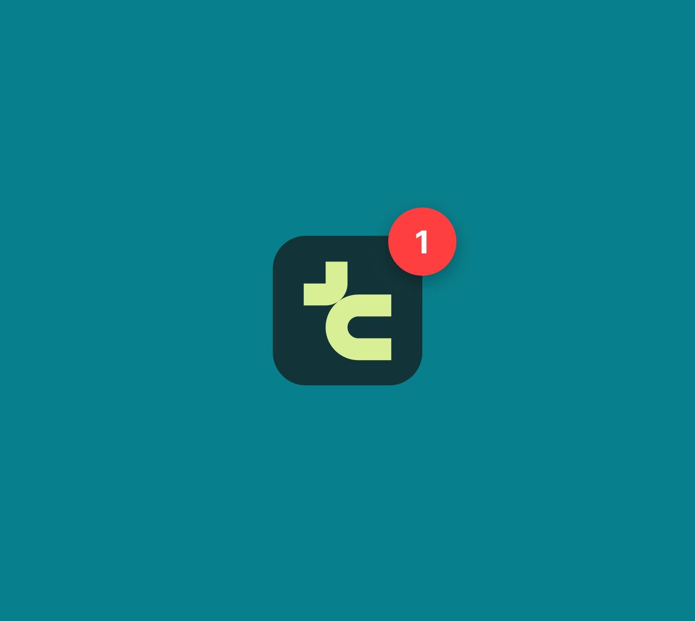
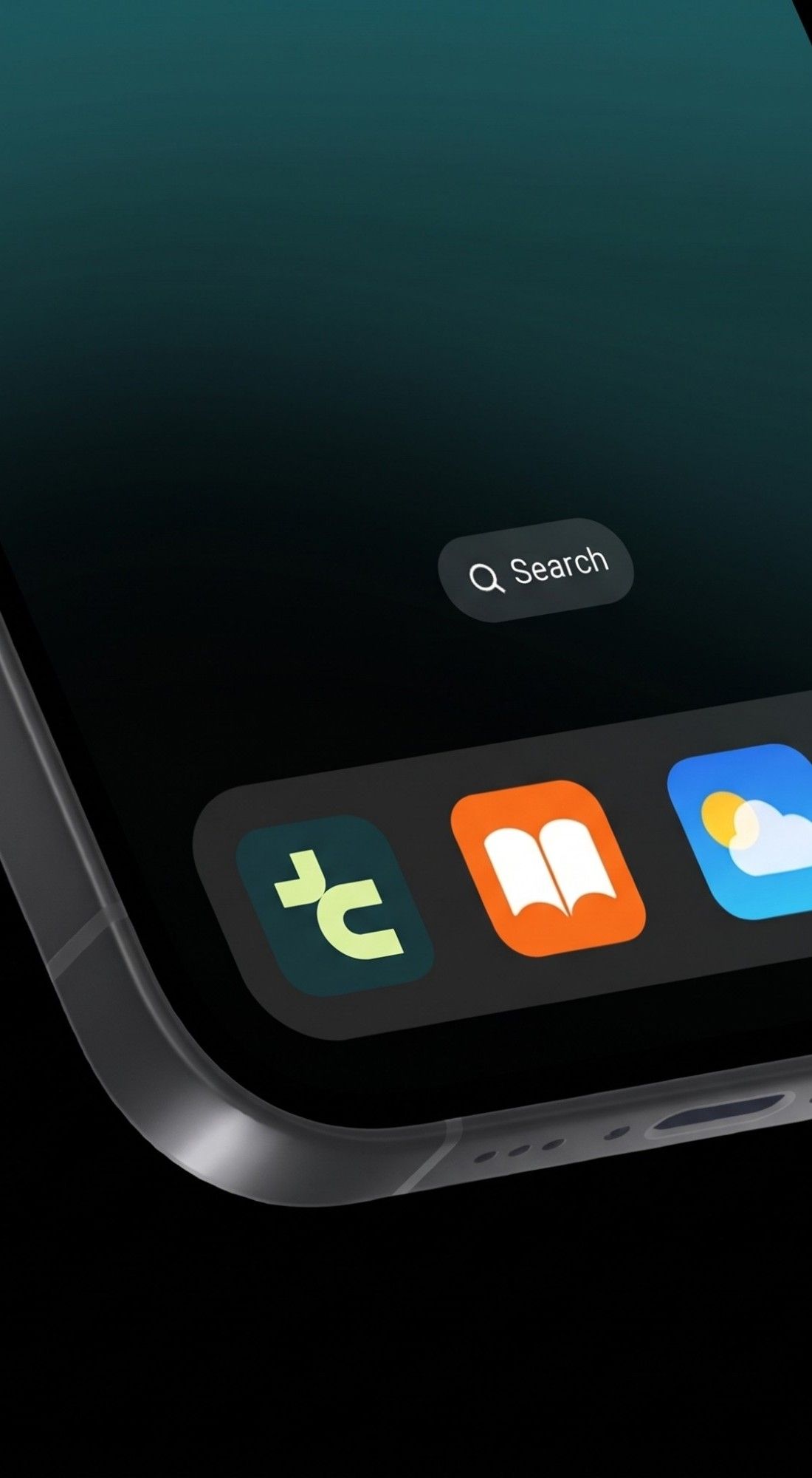
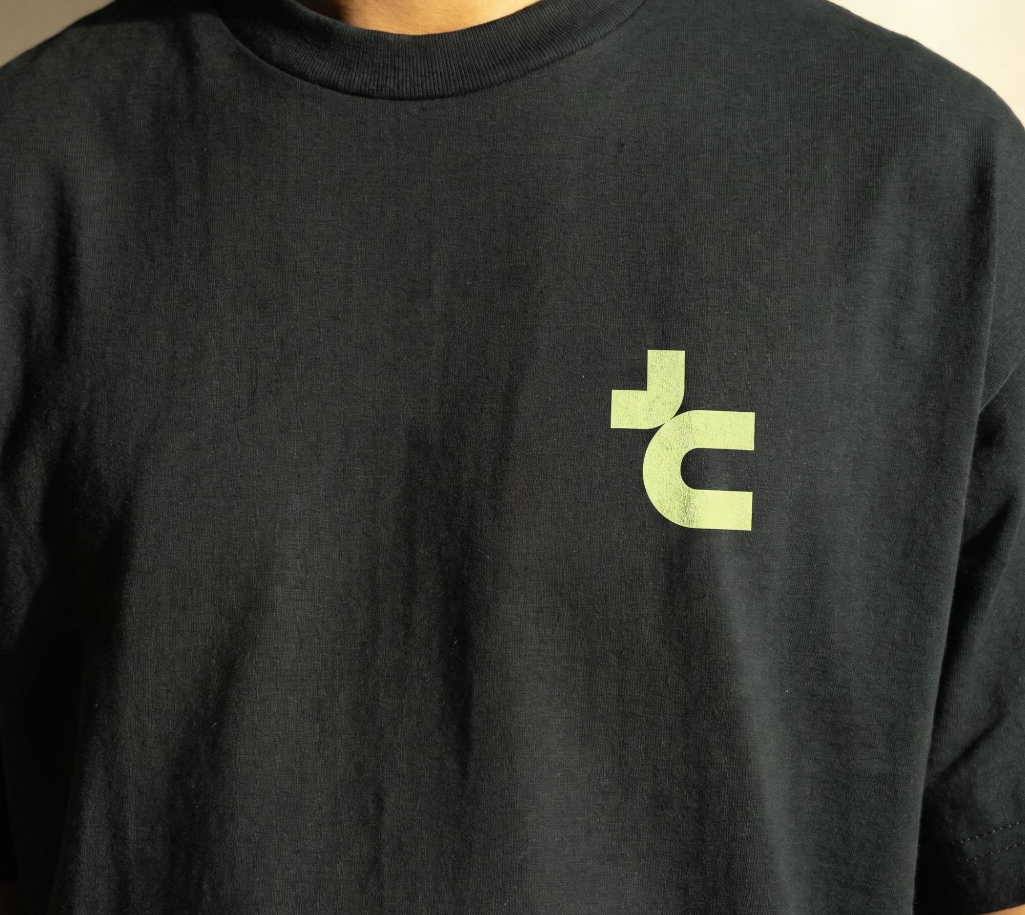
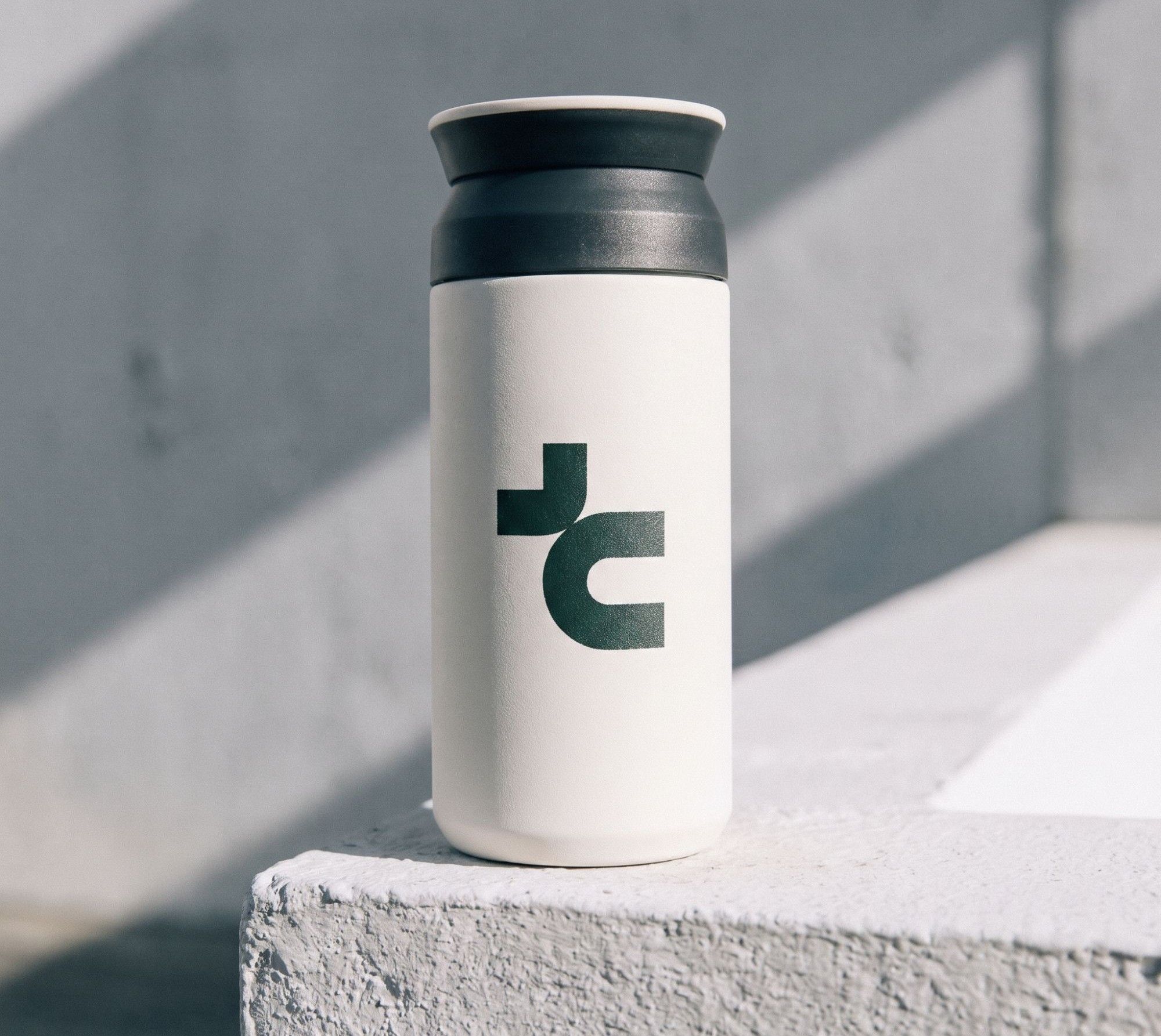
Seven touchpoints test the system on screen and off it: the app store listing, a smartwatch, a notification badge, a home-screen icon, a brand intro, a T-shirt, and a tumbler.

Result
Section 7 of 7
Everything in one place
The final board gathers the symbol, wordmark, palette, typography, and applications into a single reference for the brand.
Testimonial
“Satrio transformed our complex requirements into simple, user-friendly solutions. His work had a measurable impact on usability and customer satisfaction”