Case studyProduct
Designing Mobile Components for Privy’s Persona Design System
Project overview
Persona is Privy’s open-source design system. As one of its designers, I focused on the mobile platform: designing responsive components that engineers built into the shared library.
89components
In the open-source Persona library
2colour modes
Light and dark, from one set of semantic tokens
11+components
Designed by me for the mobile platform, most now in the code library
Challenge
Section 1 of 6
Making a shared system work on small screens
Persona is the design system behind Privy’s products. As more of those products moved to mobile, components needed more than a smaller size: they needed patterns built for thumbs, short sessions, and one-handed use.
- Problem
- Desktop-first components did not always translate to mobile screens.
- Need
- Responsive components with clear mobile patterns that every product team could reuse.
- Goal
- A consistent mobile experience across Privy products, built on the same tokens as the web.
My role
Section 2 of 6
Designing for the mobile platform
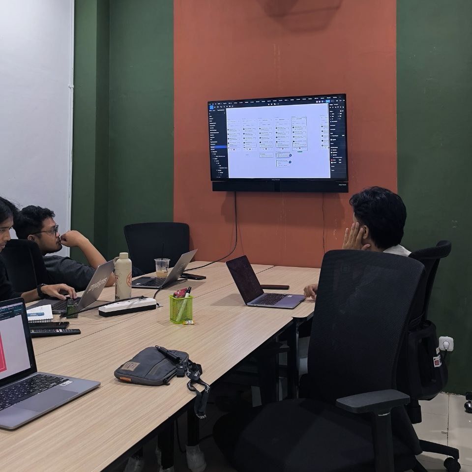
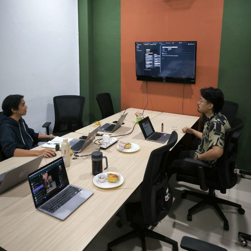
I was one of several designers on Persona. My focus was the mobile platform, so most of my work was responsive components for small screens.
- Team
- 5 designers on Persona, working with Privy’s engineering team
- Focus
- Mobile platform: guidance, feedback, and status components that adapt to small screens
- Handoff
- Engineers built the components in Vue and publish them as an open-source library
- Period
- 2022–2024
Foundations
Section 3 of 6
Semantic tokens for light and dark
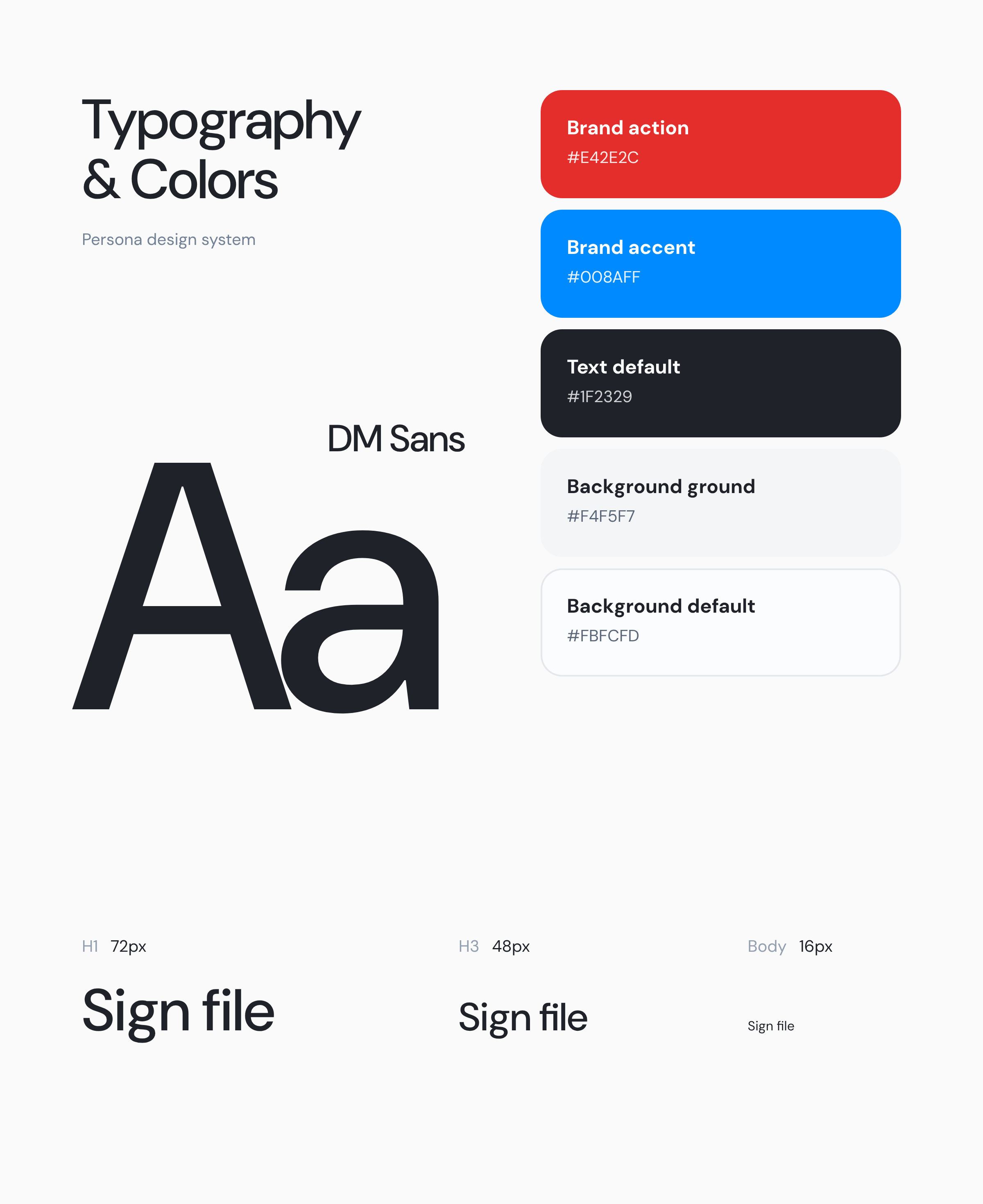
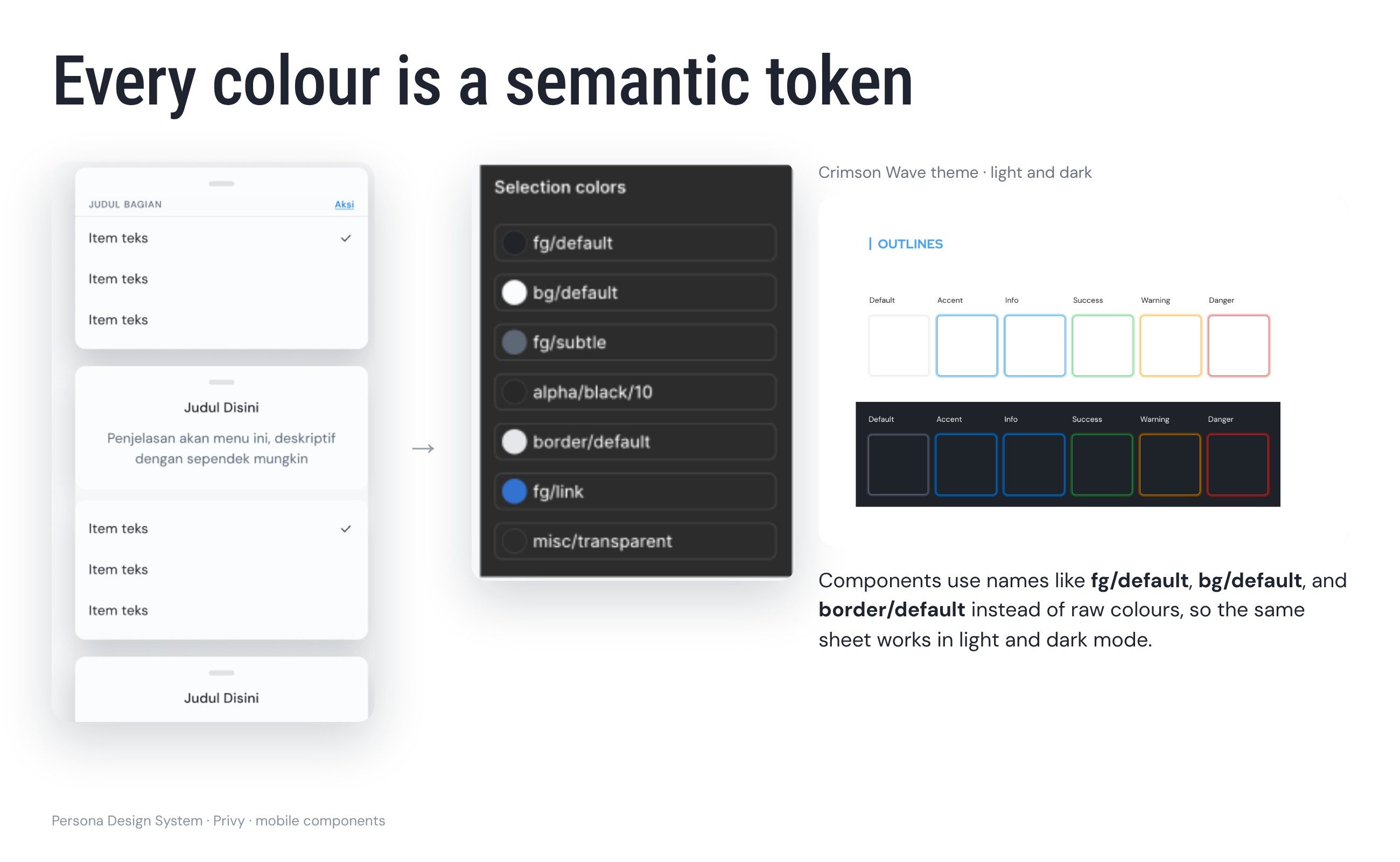
Every colour in a component points to a semantic token from the Crimson Wave theme, such as fg/default, bg/default, or border/default, rather than a raw value. The same component then works in light and dark mode, and focus outlines follow the same six states: default, accent, info, success, warning, and danger.
Mobile components
Section 4 of 6
Guidance, feedback, and status on small screens
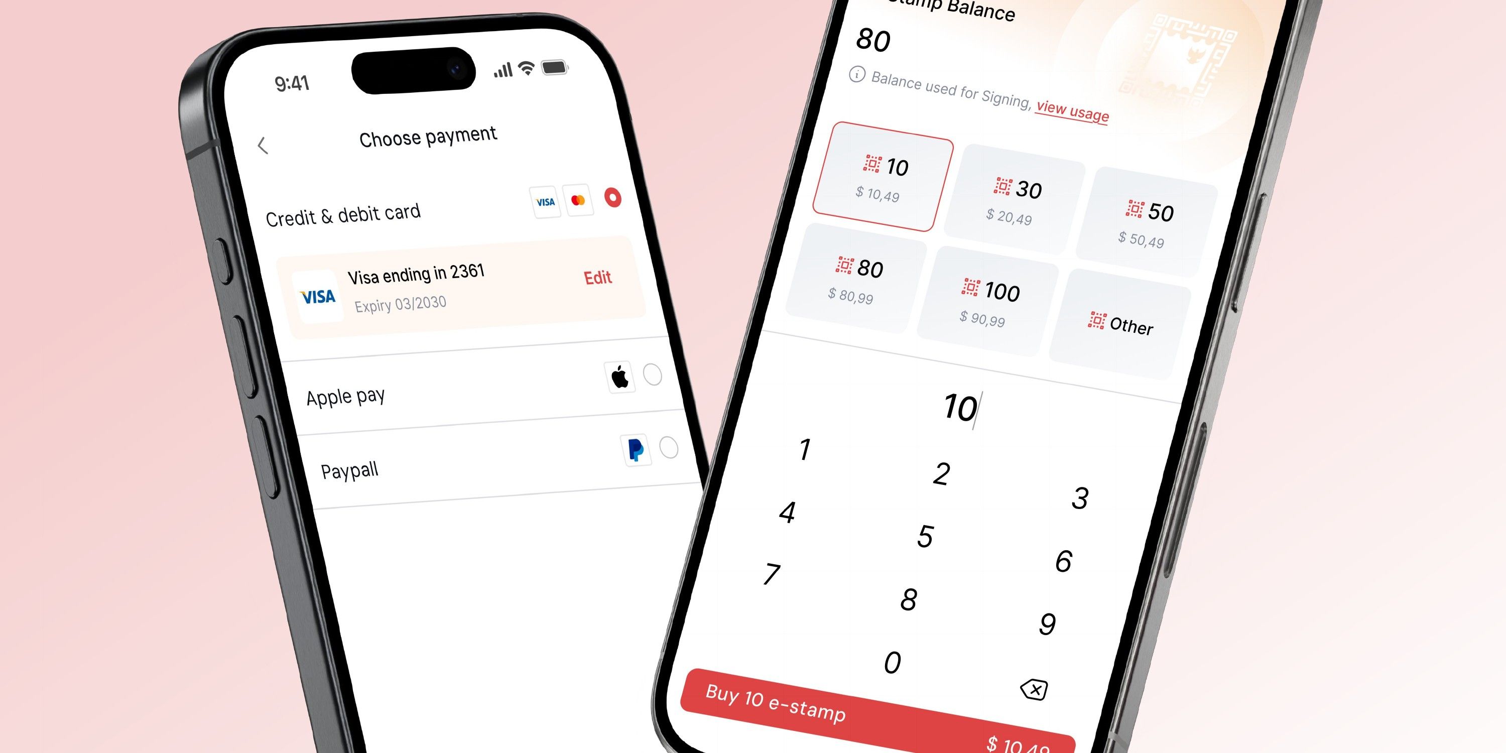
Most of my work covered the components that guide people and tell them what is happening: onboarding, confirmations, alerts, and status. On mobile they had to stay readable and reachable on a narrow screen without covering the task underneath.
- Guidance
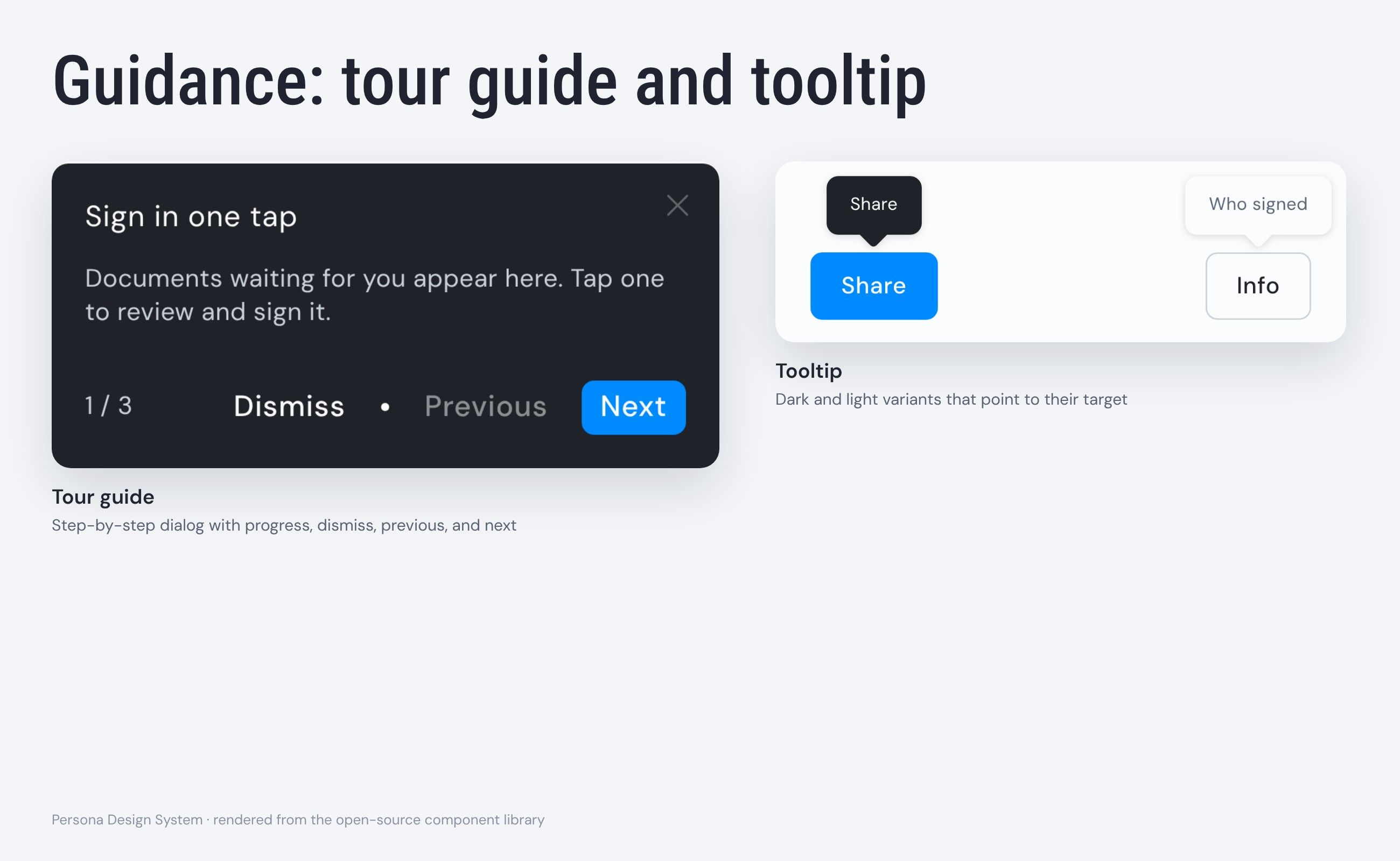
- Walkthrough, tour guide, and tooltip, to introduce features without leaving the task
- Feedback
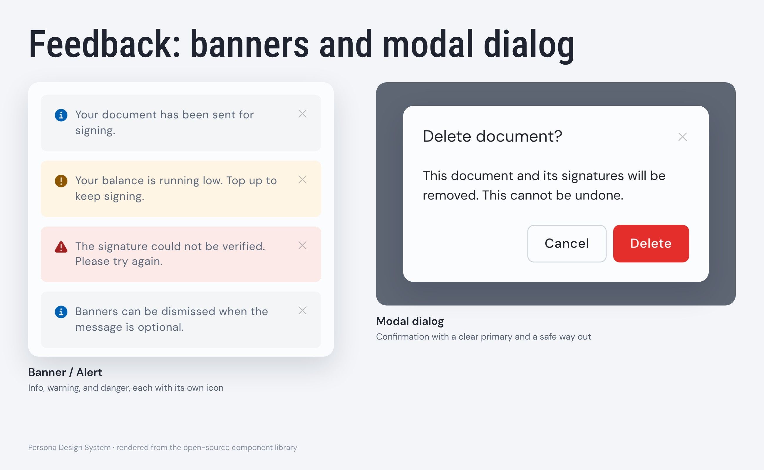
- Modal dialog, banner and alert, flag alert, and pop-up, to report results and ask for decisions
- Status and input
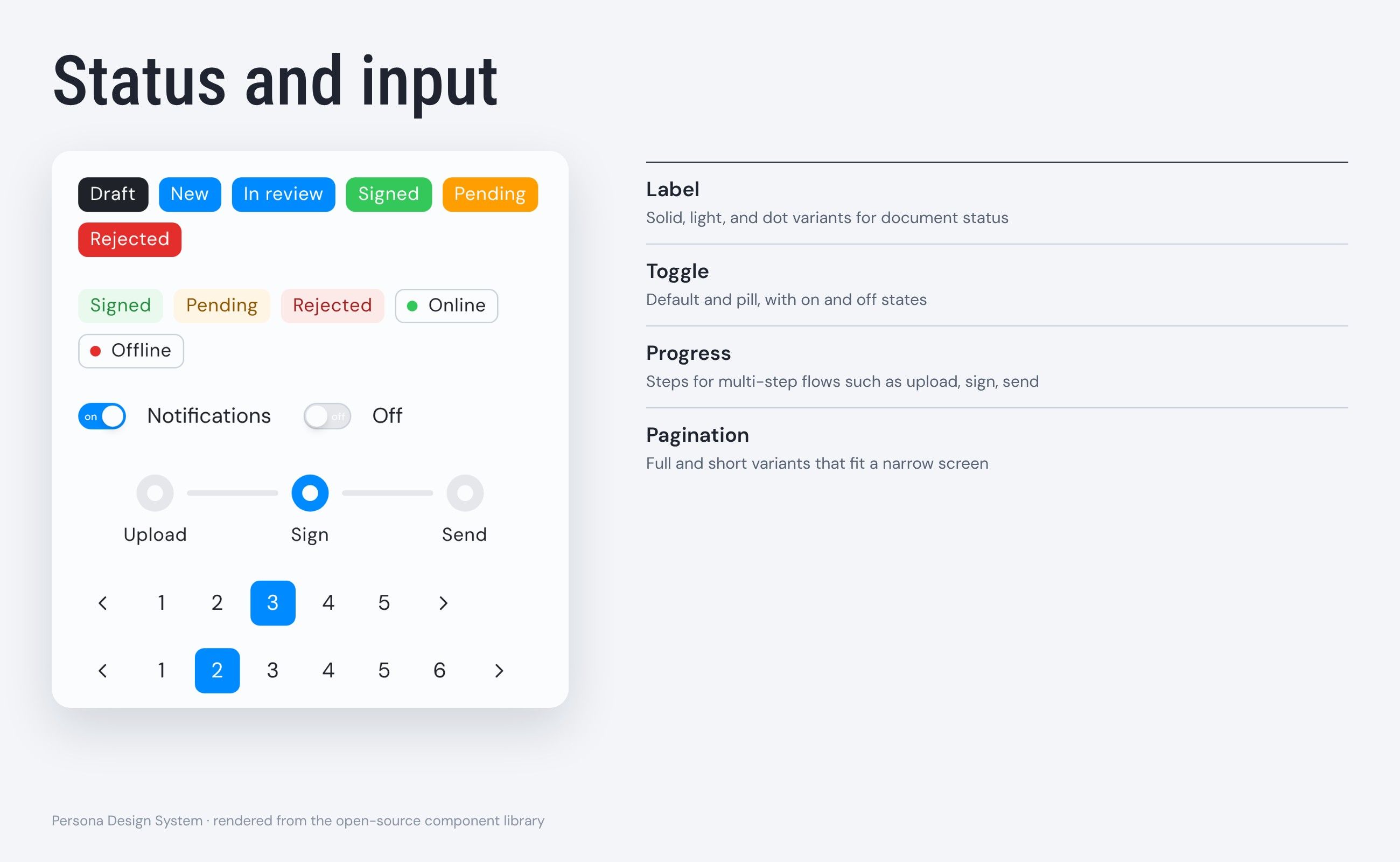
- Toggle, label, progress, rating and impression, and pagination states
From design to code
Section 5 of 6
From Figma to an open-source library
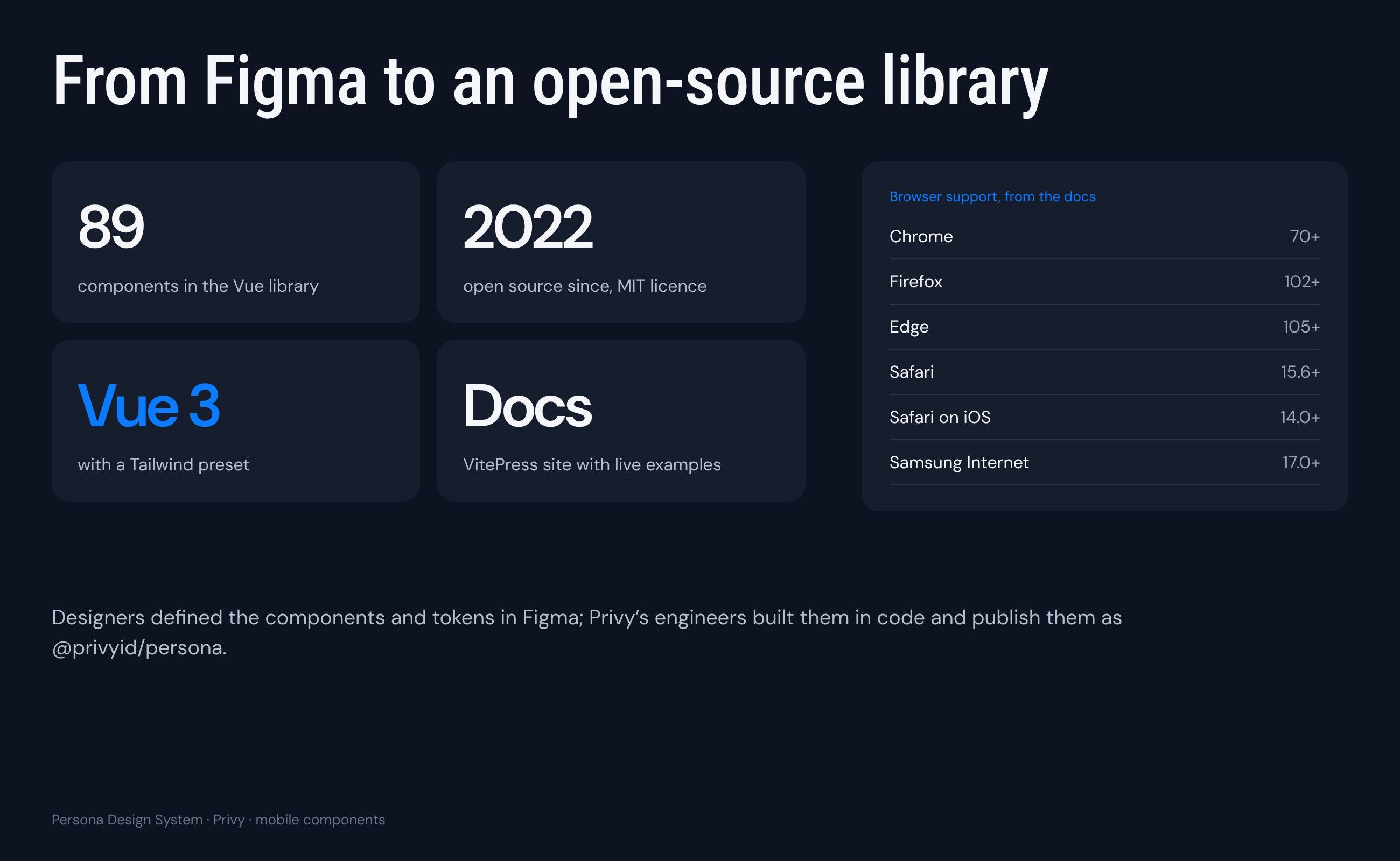
Designers defined components and tokens in Figma. Most of the components I designed, including tour, tooltip, toggle, progress, pagination, modal, label, pop-up, and banner, shipped in the library. The team used a merge request note, changelog, and component status page to manage changes, and Privy’s engineers built them in Vue 3 with a Tailwind preset and publish them as an open-source library with its own documentation site.
Reflection
Section 6 of 6
Adapt quickly, but question every new component
Working on Persona taught me to adapt quickly. New features often came with new needs, and the system had to keep up. But not every request needed a new component. Before designing one, I learned to ask whether an existing component could cover the case, or whether something new was really needed. That question kept the library smaller, more consistent, and easier for the whole team to use.