Case studyMotion
Making Pulsefold Easier to Learn Through Motion

Project overview
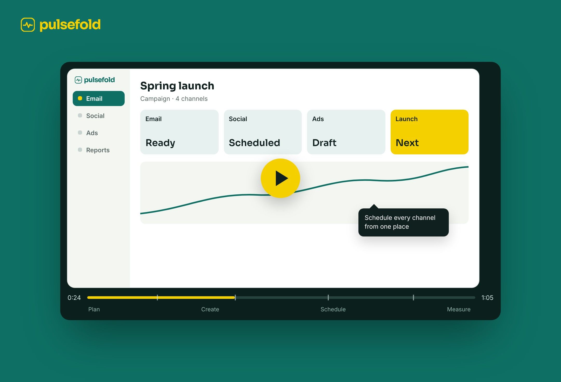
Pulsefold is a fictional all-in-one marketing platform for email, social, ads, and reports. In this self-initiated concept, I used motion to make a crowded product easier to learn, with an explainer video and in-app animations that guide new users through their first campaign.
2months
From the first user journey to the final animations
2formats
An explainer video and animations inside the product
1campaign
Followed from idea to results, as the story of the video
Challenge
Section 1 of 6
Too much to learn on day one
All-in-one sounds simple, but new users meet everything at once: an email builder, a social scheduler, ads, and reports. Static tooltips and long help articles explain each tool on its own, not how they work together.
The goal was to help a new user launch a first campaign without feeling lost.
- Problem
- New users see every tool at once and do not know where to start.
- Need
- A way to show how the tools connect, not just what each one does.
- Goal
- A first campaign that feels guided, from sign-up to launch.
Approach
Section 2 of 6
Show the flow, not the features
Instead of explaining each feature, I followed one campaign through the whole product. The same story shaped both formats: a short explainer video for the landing page, and small animations inside the app.
- 1Map the first runThe steps a new user takes before their first campaign
- 2StoryboardSix scenes, one campaign from idea to results
- 3Key framesUI scenes and states designed in Figma
- 4AnimateVideo and in-app motion built in After Effects
Explainer video
Section 3 of 6
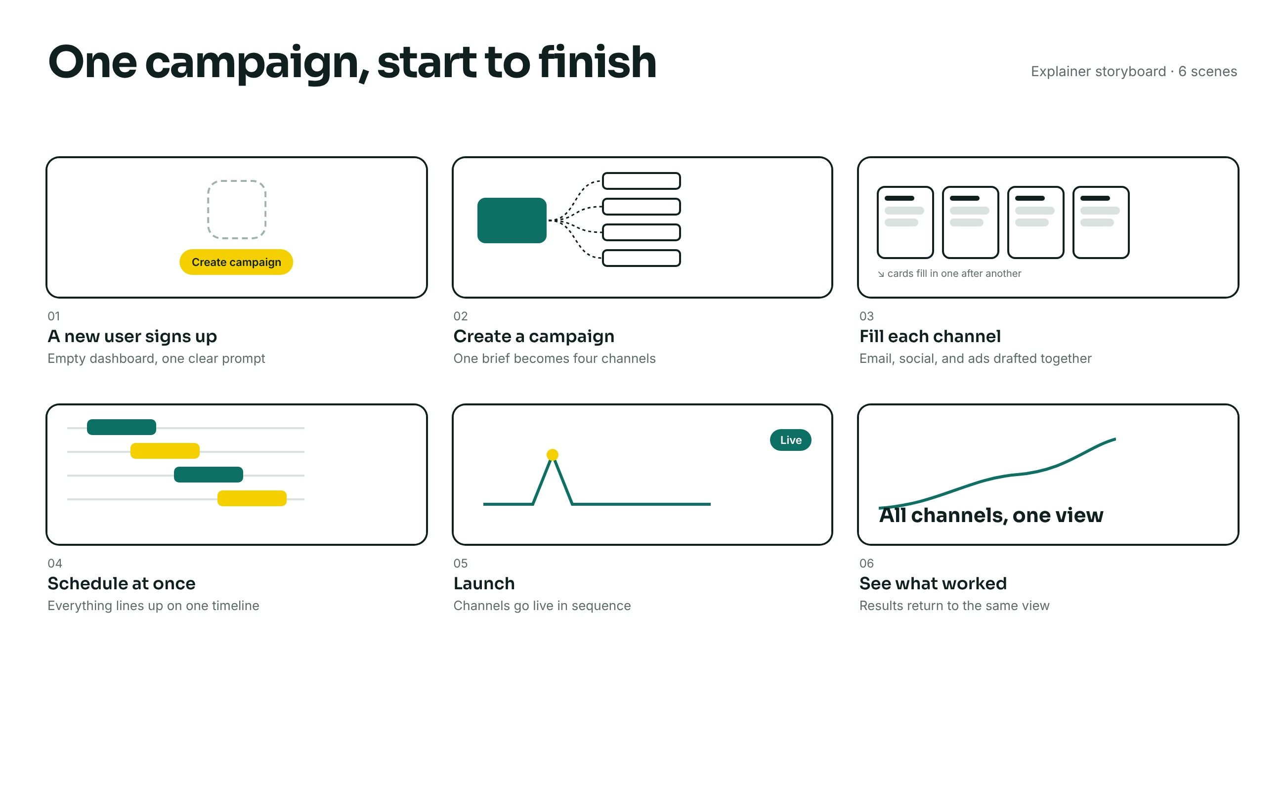
One campaign, start to finish
The explainer follows a single campaign: a new user signs up, creates one brief, fills each channel, schedules everything at once, launches, and sees the results in the same view. Each scene answers one question a new user would have.
Feature animations
Section 4 of 6
Small moments that teach
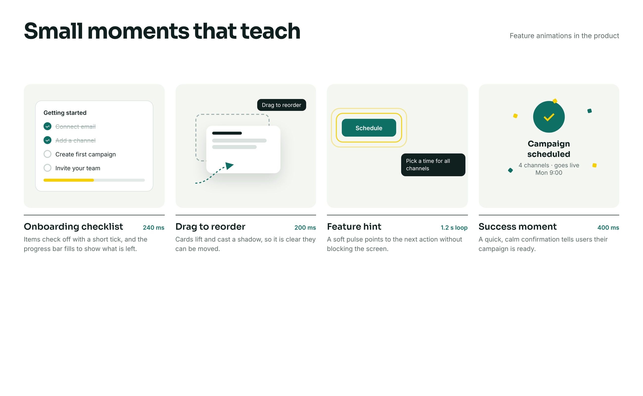
Inside the app, motion does the teaching at the moment it is needed. Each animation is short and tied to one action.
- Onboarding checklist
- Items tick off and the progress bar fills, so users see what is left.
- Drag to reorder
- Cards lift and cast a shadow to show they can be moved.
- Feature hint
- A soft pulse points to the next step without blocking the screen.
- Success moment
- A calm confirmation tells users their campaign is ready.
Motion principles
Section 5 of 6
Calm, quick, and purposeful
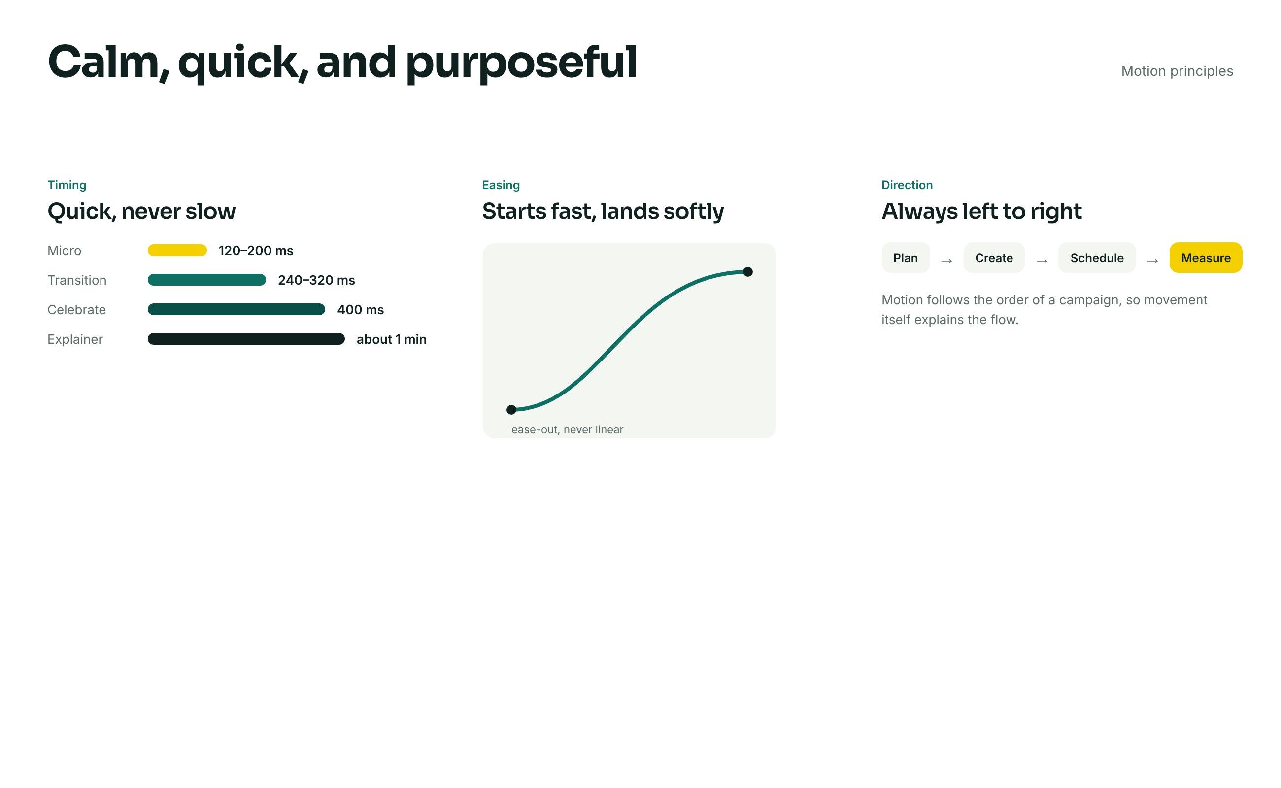
A few rules kept every animation consistent: short durations so motion never slows users down, ease-out curves that start fast and land softly, and movement from left to right, following the order of a campaign.
Reflection
Section 6 of 6
Motion as a teacher
This is a concept, so the onboarding has not been tested with real users yet. The next step would be to measure how long new users take to launch their first campaign, with and without the animations, and to cut any motion that does not help.